 1FIT2023–2024
The redesign that moved 1FIT’s iOS app NPS from 55 to 82
Interactive prototype
Final result
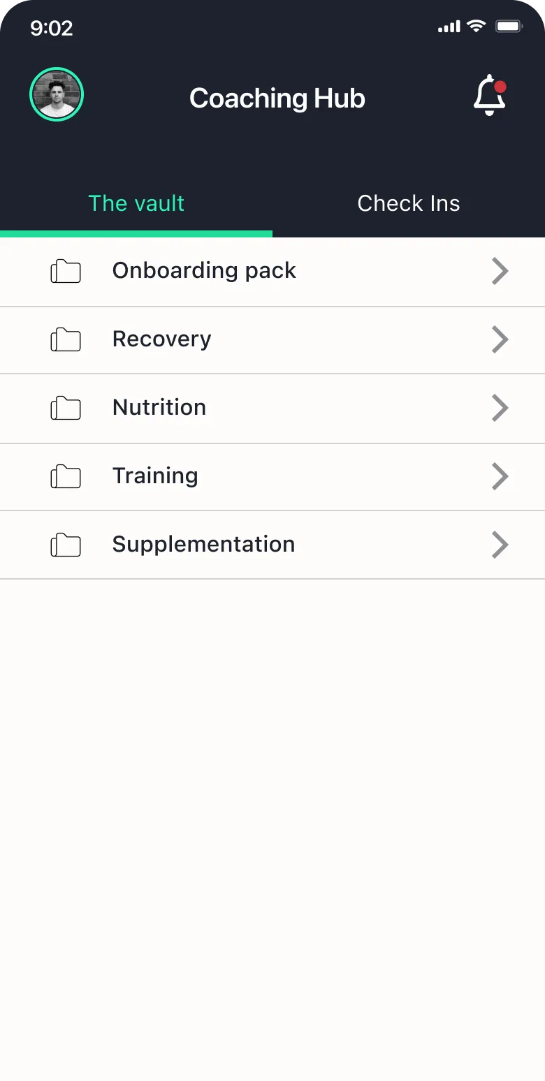
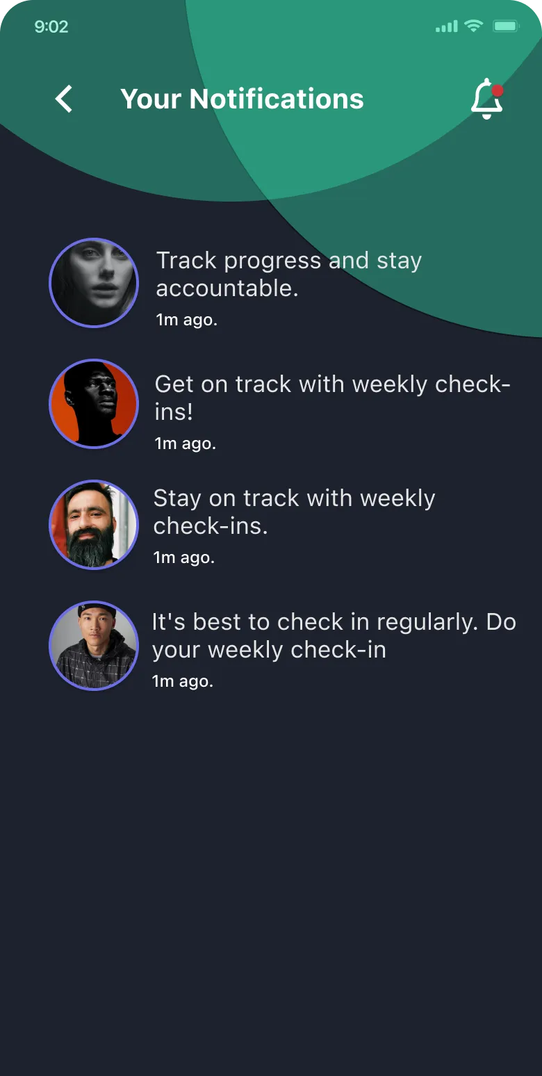
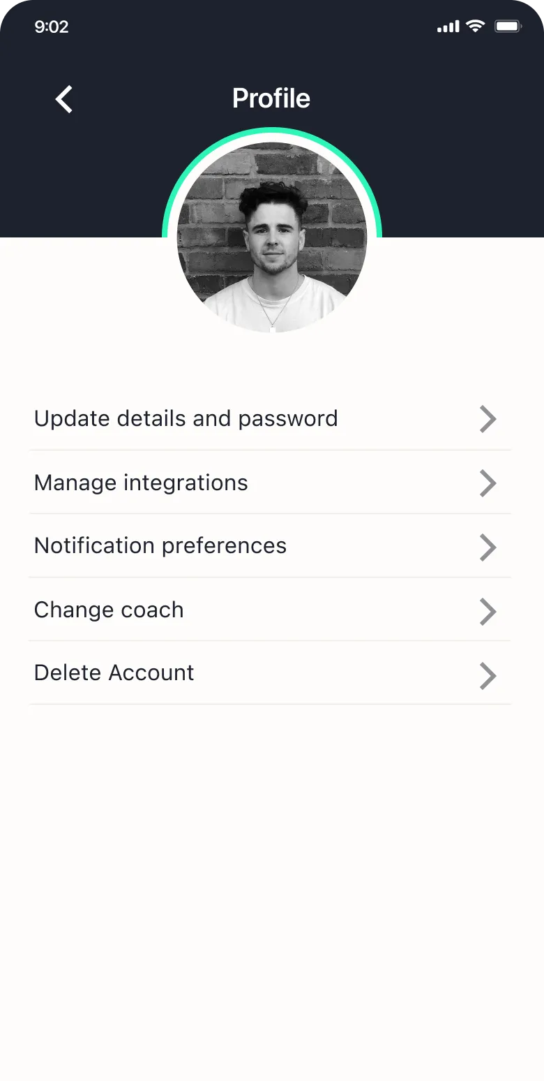
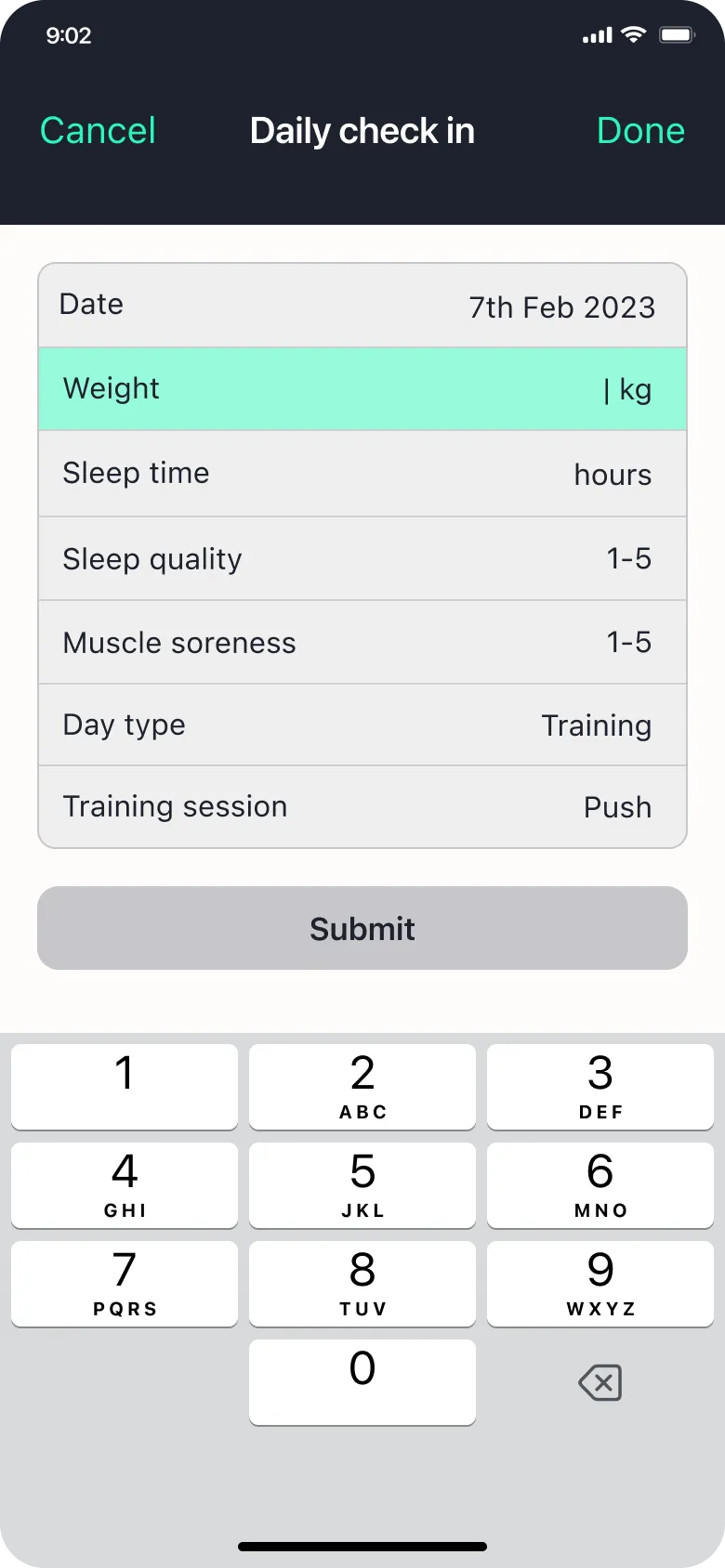






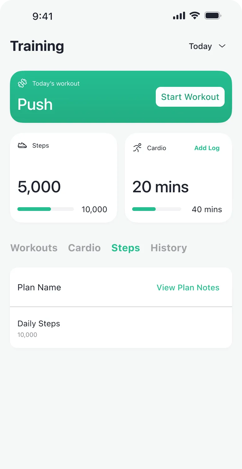
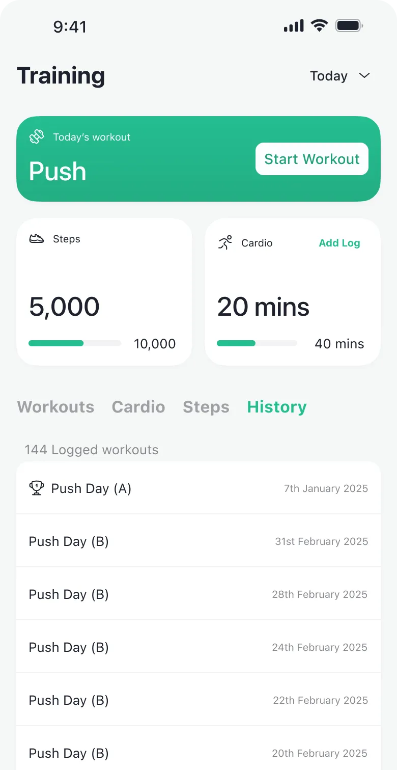
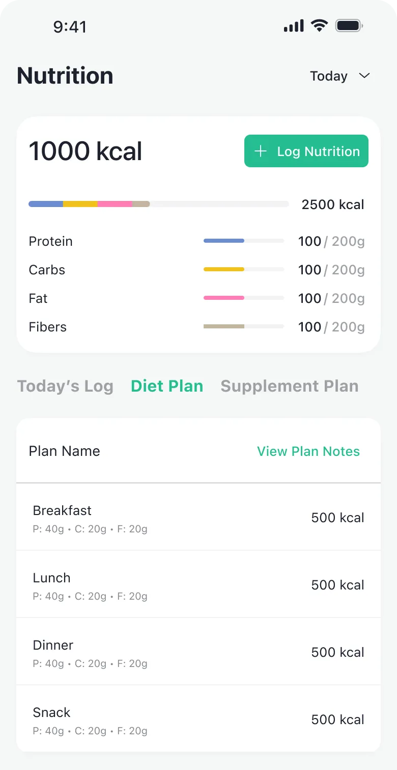
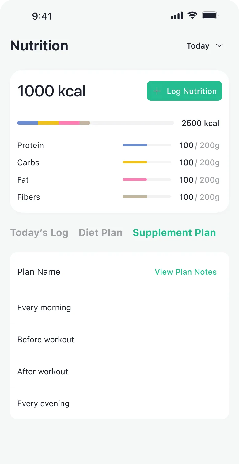





Background
About 1FIT: the B2B2C model
1FIT is a bootstrapped startup that sells personal trainers an app for their clients, under each trainer’s own brand. The coach sets the plan on the web; the client logs training, food and check-ins on the phone; the coach answers. I worked with them as a freelancer from spring 2023, when they served about 350 coaches and 10,000 clients and the team was rebuilding the hybrid app as a native one. I was their only designer.
Constraints
- A soft white label: each coach could change the logo and the accent colour, nothing else.
- A small bootstrapped team, one tech lead and two developers, so every screen had to be worth building.
- A full rebuild, from hybrid to native, due in September: a chance to change the structure, with no time to redesign twice.
Problem
Finding the problems: UX audit
The brief was “make the iOS app better”. Before redesigning, I suggested a UX audit of the whole app: I defined the clients’ jobs to be done (opens in a new tab), found the usability issues and ranked them, and suggested metrics to measure how the app performed. We couldn’t track those metrics, so we chose to measure the NPS before and after the release. Below are the main findings, and the deck I presented to the client.

- Reach their fitness goalDesired outcomeQuick logging, and visible progress towards the goal.
- Receive personalised guidanceDesired outcomeMore prominence for what the coach creates: feedback, the fitness journey, resources and messages.
Issues found
- High priority
The home had no clear purpose
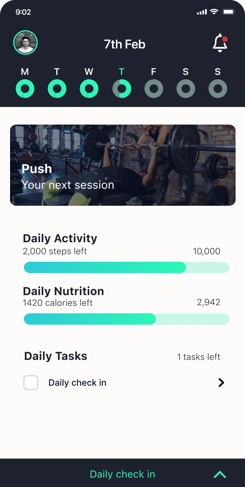
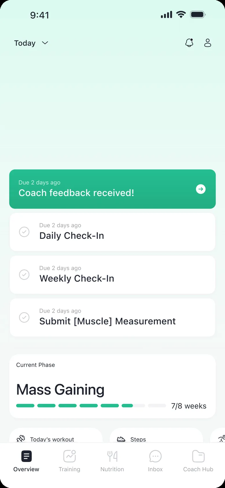
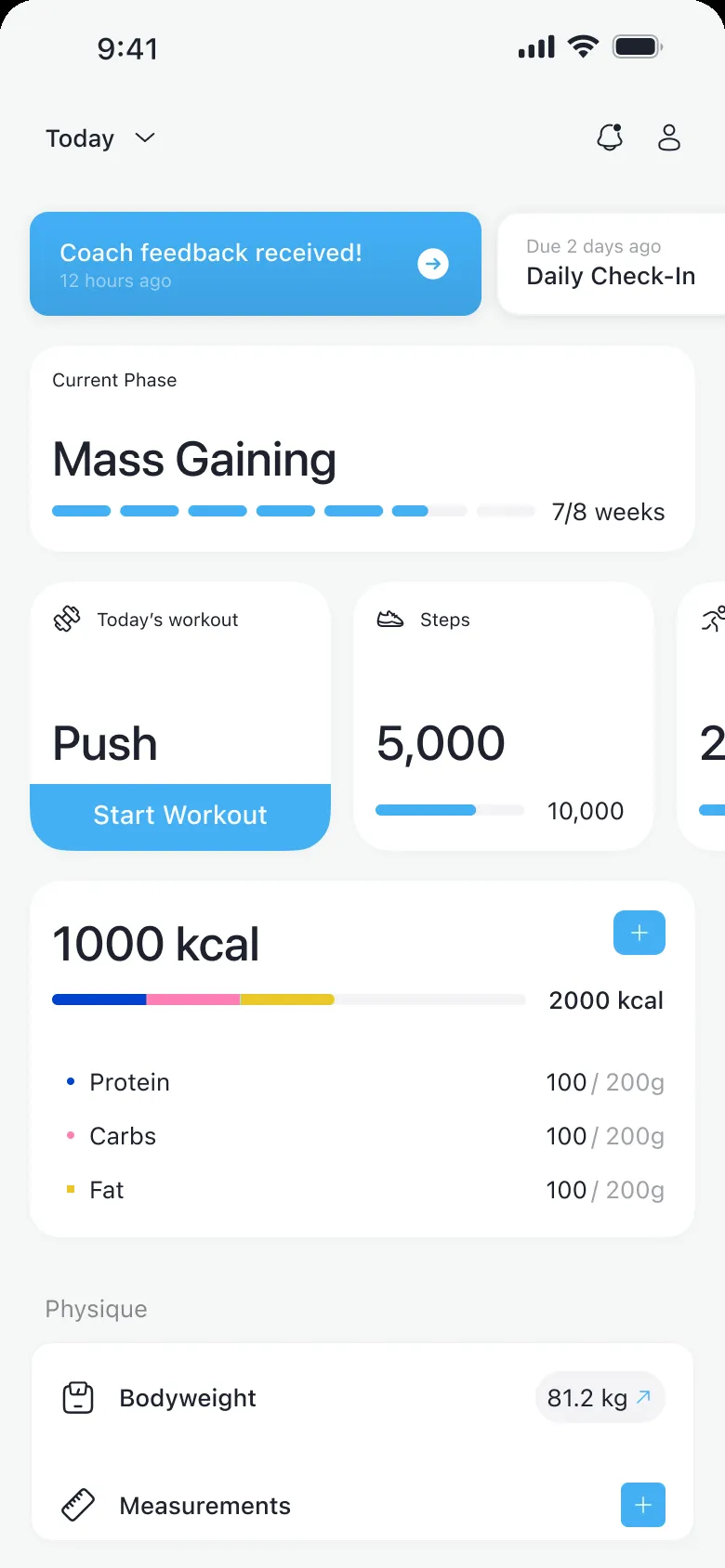
A date strip, the next session, two bars and one task on a banner: a mix of sections, with nothing to do first.
- High priority
Logging sat two or three taps deep
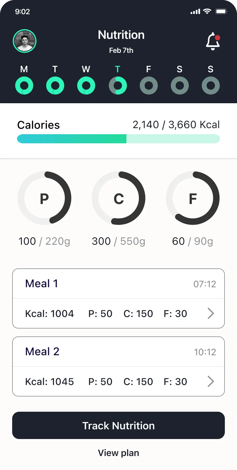
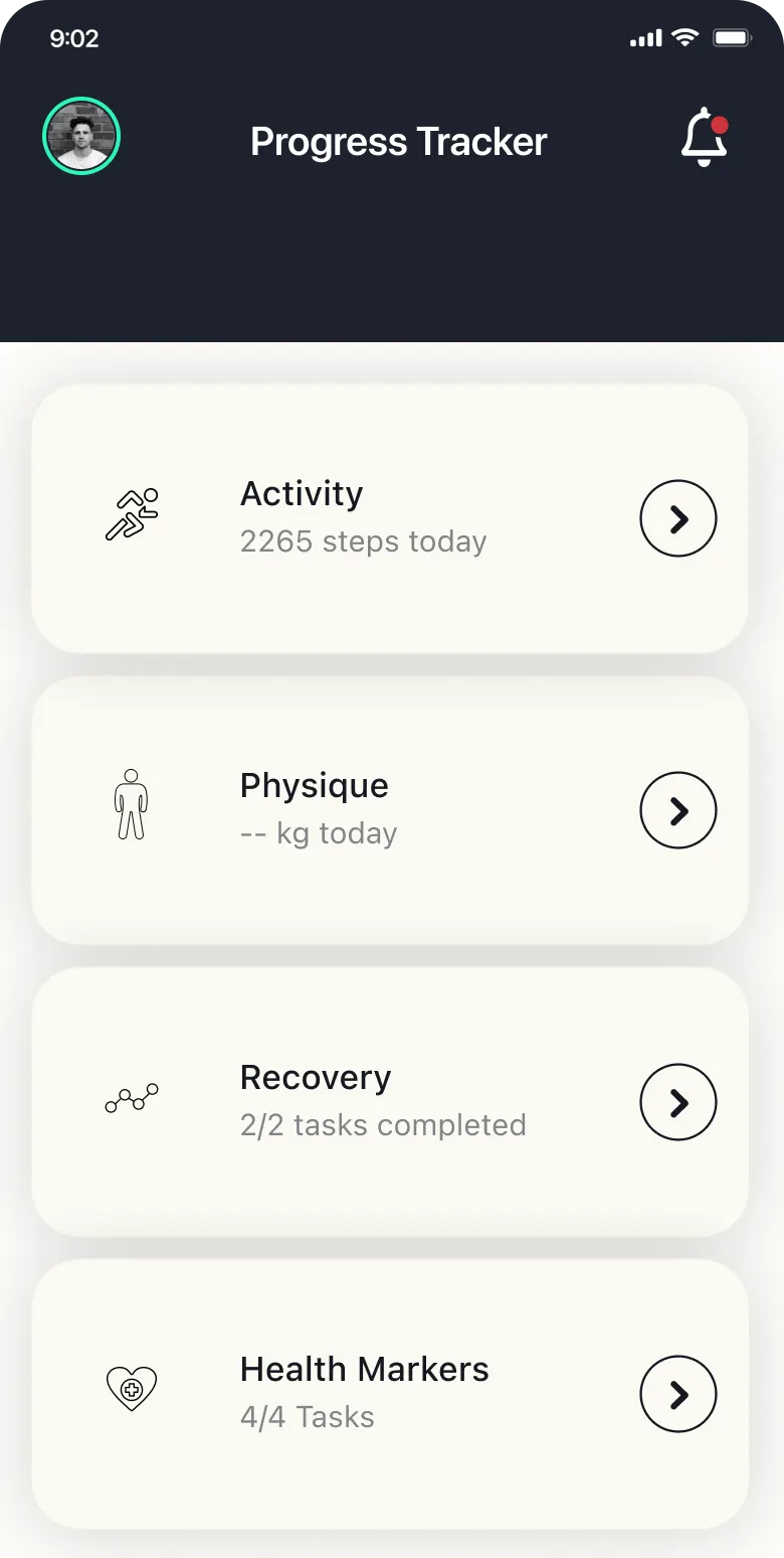
The action the app lives on was hidden under Progress and Nutrition, with no sign of how far you were from your targets.
- High priority
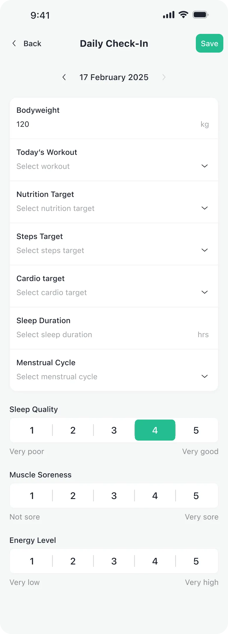
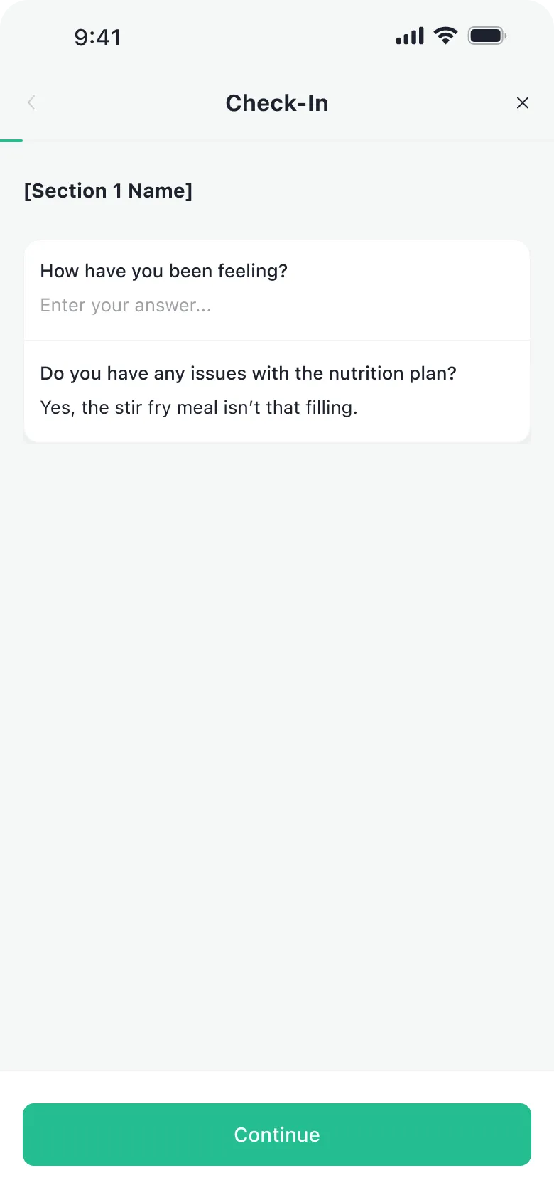
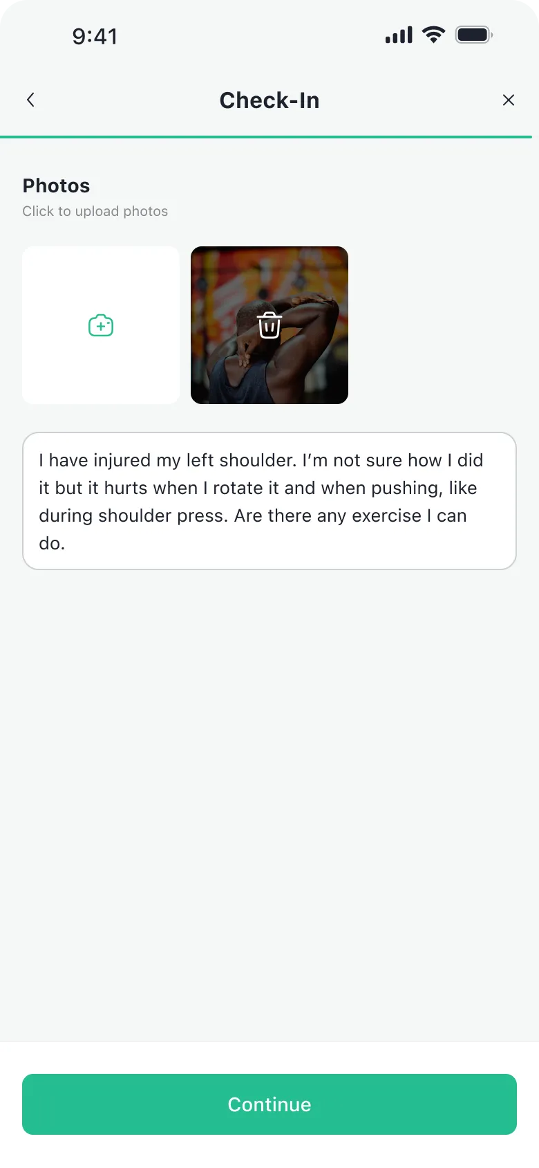
The daily check-in asked you to remember
Free fields instead of choices, and no way to save it half done.
- High priority
The coach’s feedback was buried
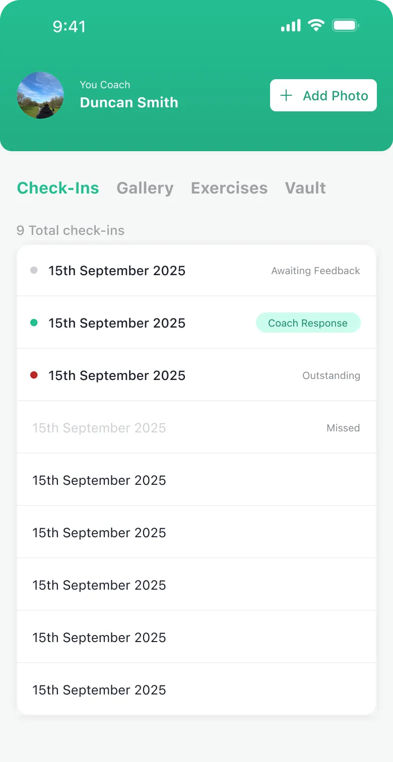
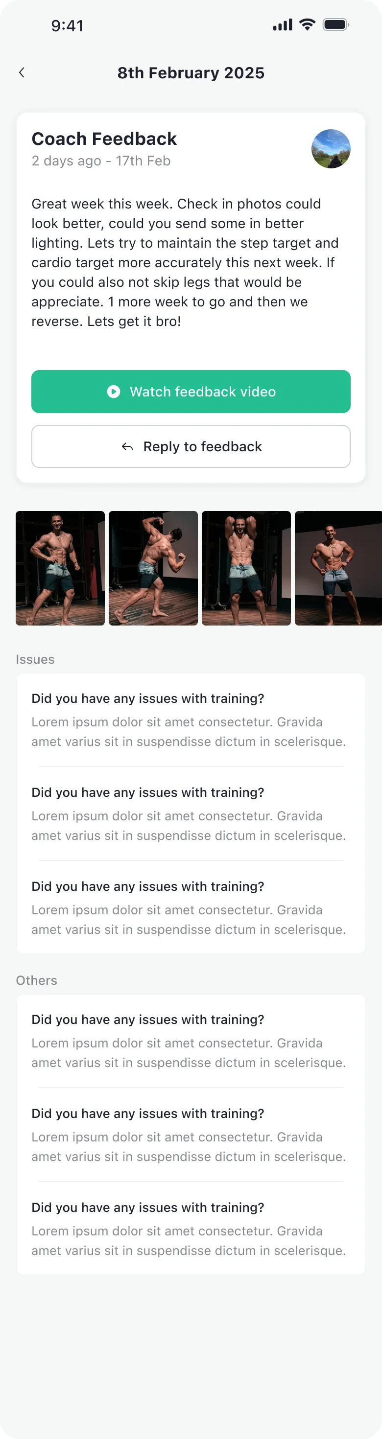
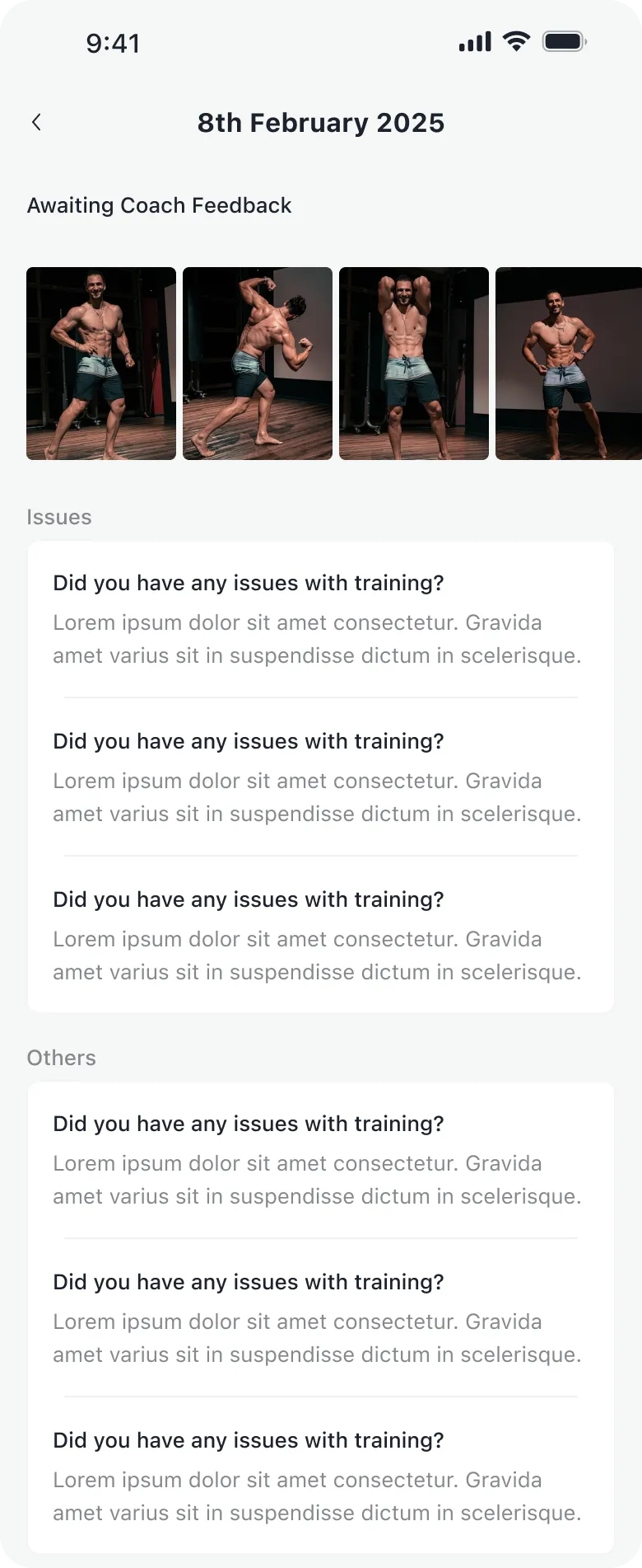
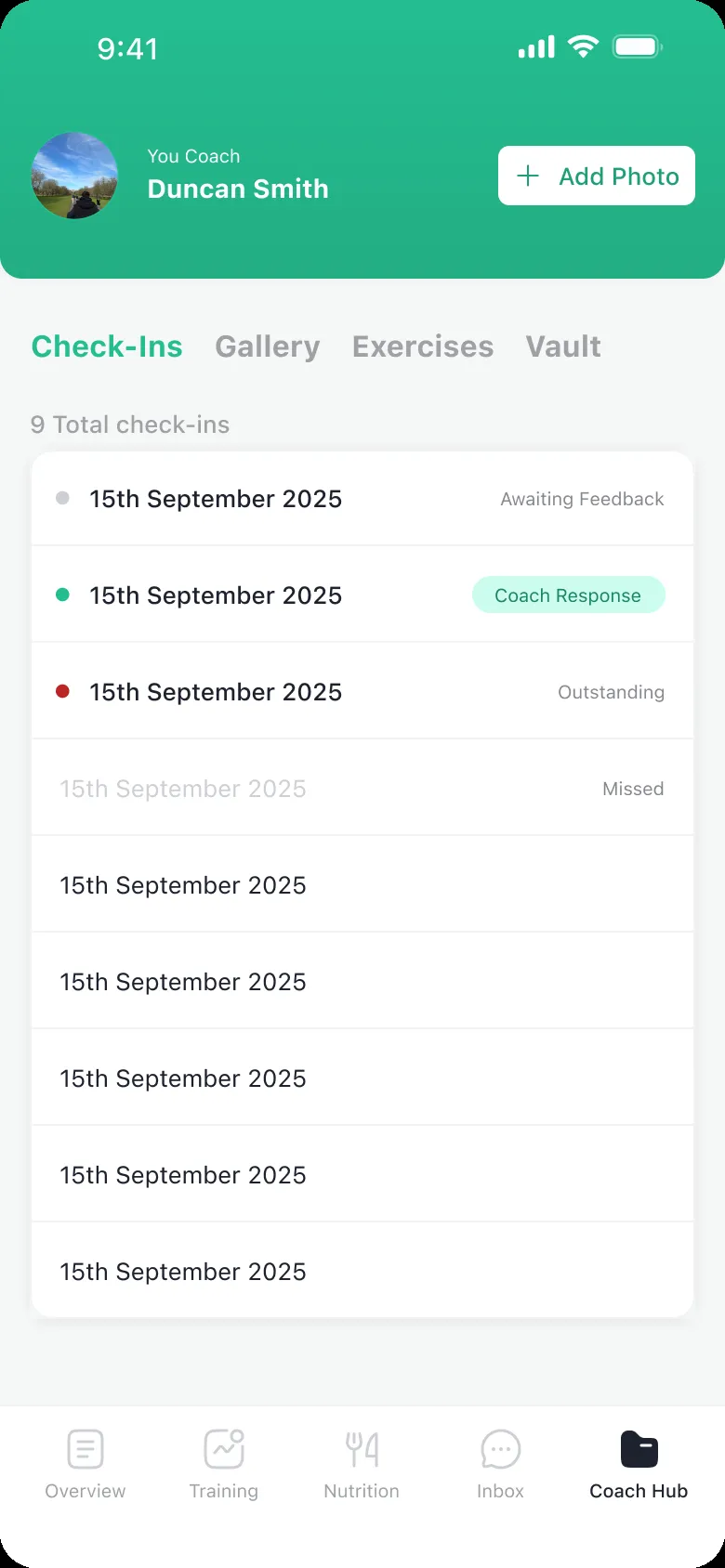
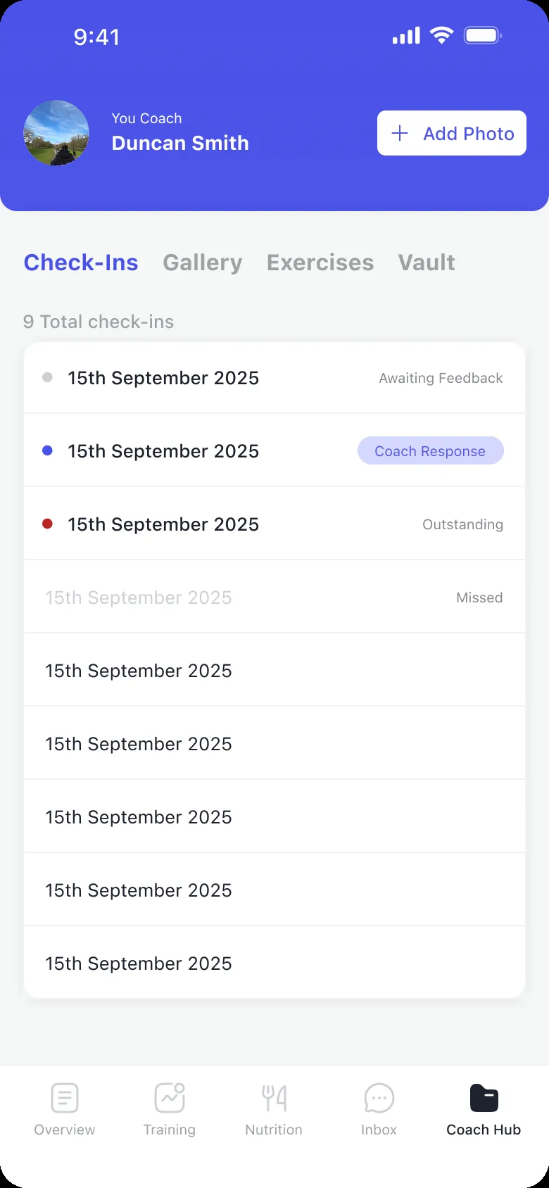
Check-ins sat in the hub’s second tab, and the coach’s reply at the bottom of the detail.
- Medium
The coach’s reply came last
Inside a check-in, the feedback sat below everything the client had written.
- Medium
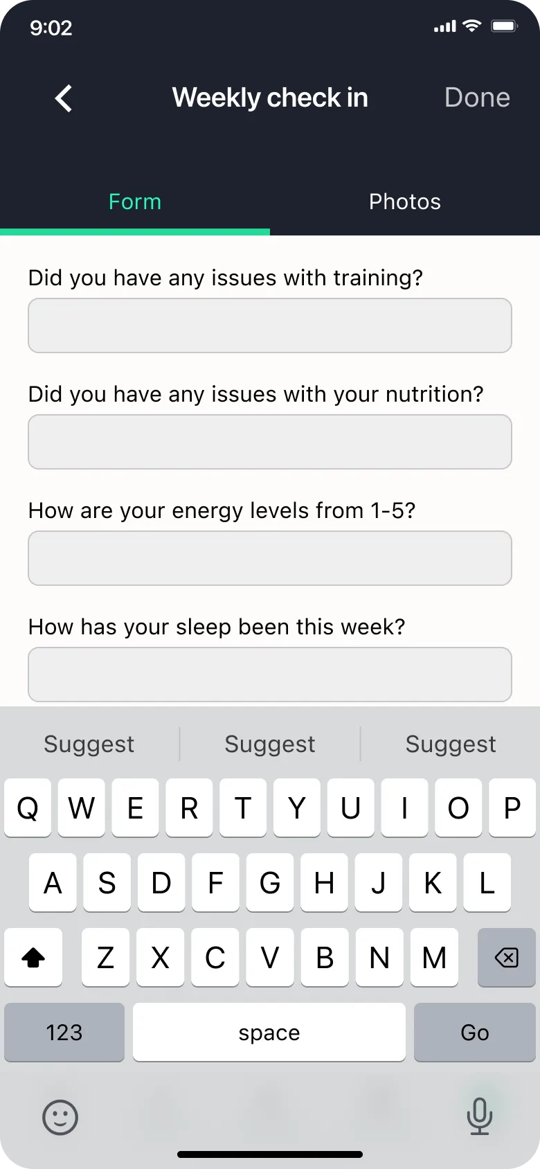
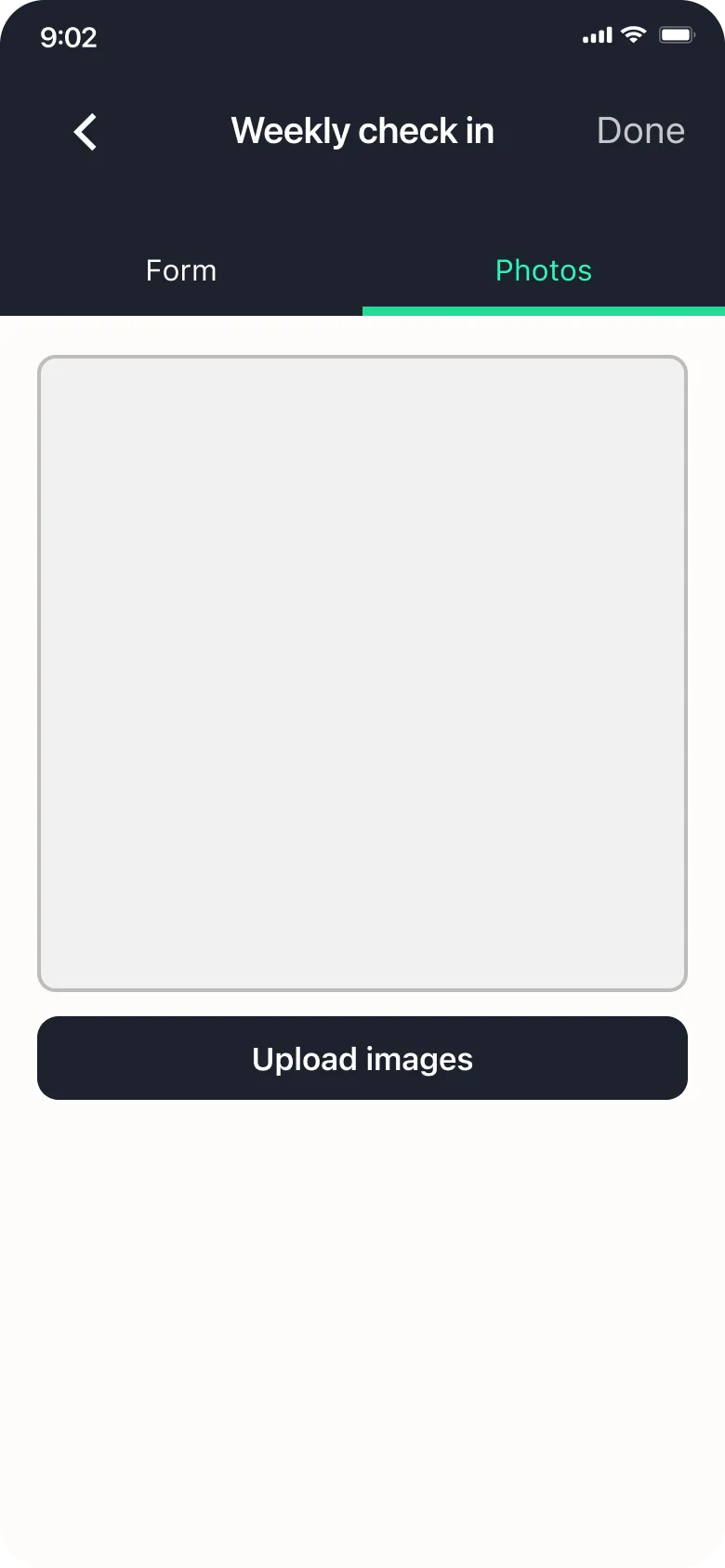
The weekly check-in came in tabs
A long form split into tabs made a weekly task slower than it had to be.
- Medium
Easy to slip mid-workout
Entering sets and weights during a session invited mistakes.
- Low
Workout details were hard to read
Jargon and dense lists, on the screen people check right before training.
- Low
A rare action took a lot of room
Moving exercises around got more space than how often anyone does it.

Decisions
Decision 01
A coaching app, not a tracker
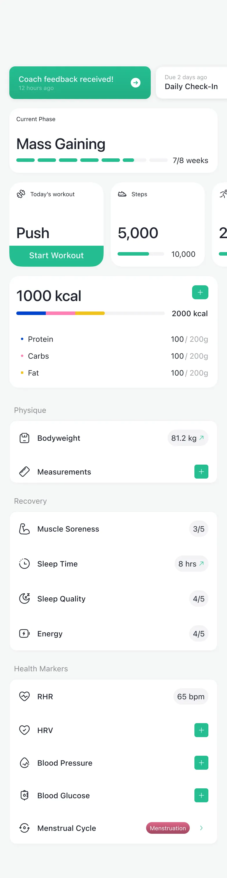
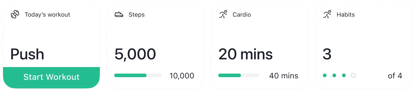
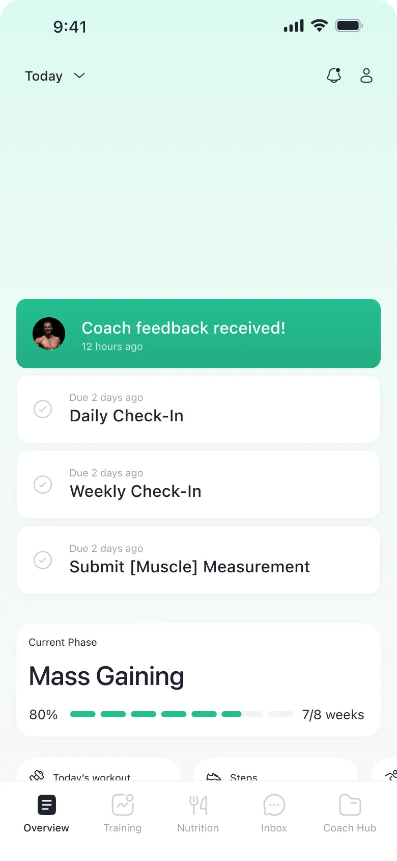
The old app looked like every other fitness tracker. But people don’t come to 1FIT to track their steps. They come because they have a coach, and the coach has a plan for them. Logging is just how they follow it.
Other trackers: built to show progress
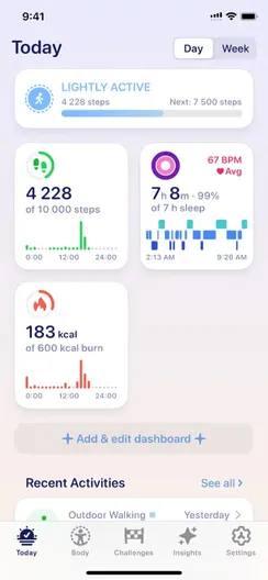
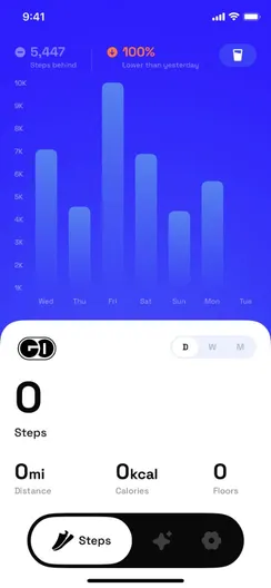
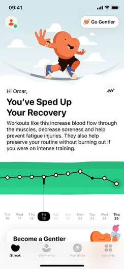
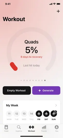


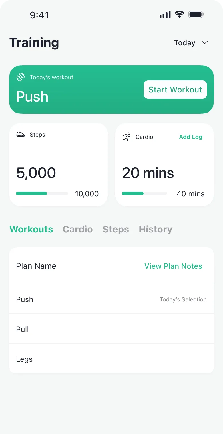
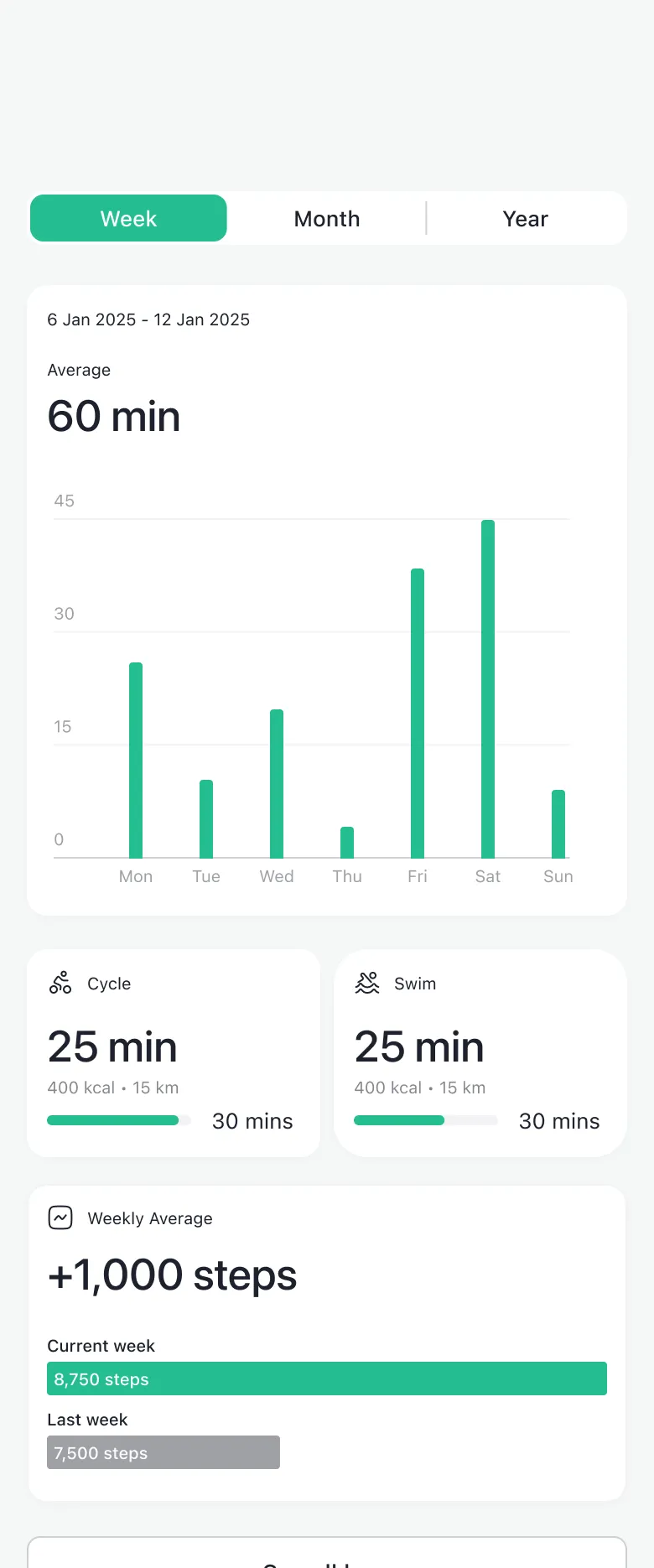
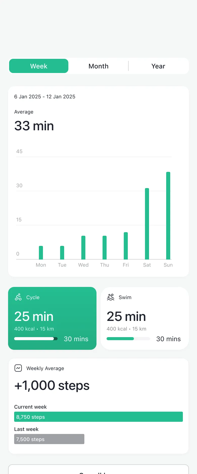
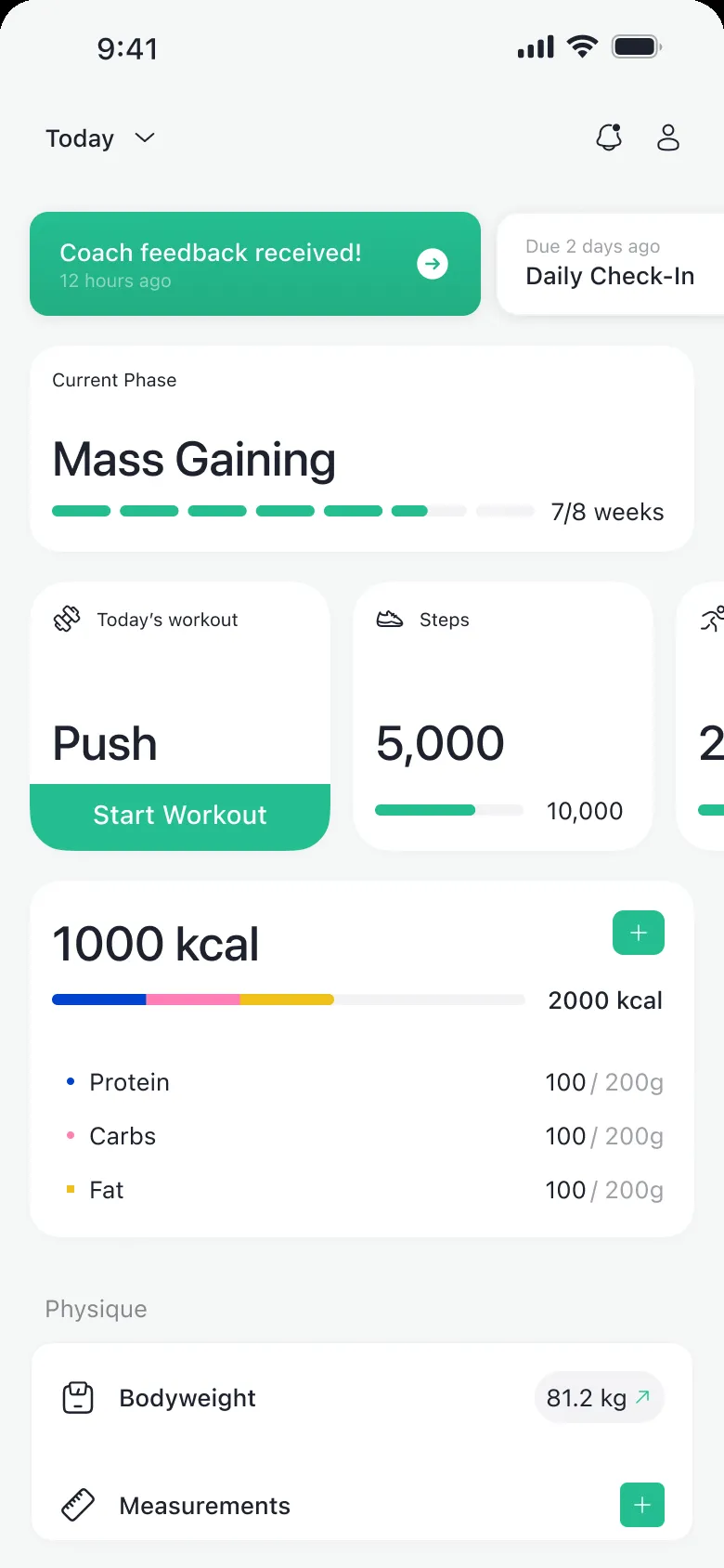
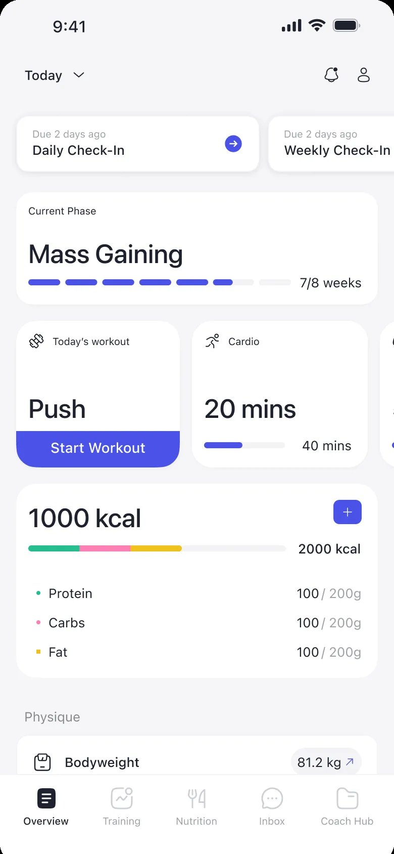
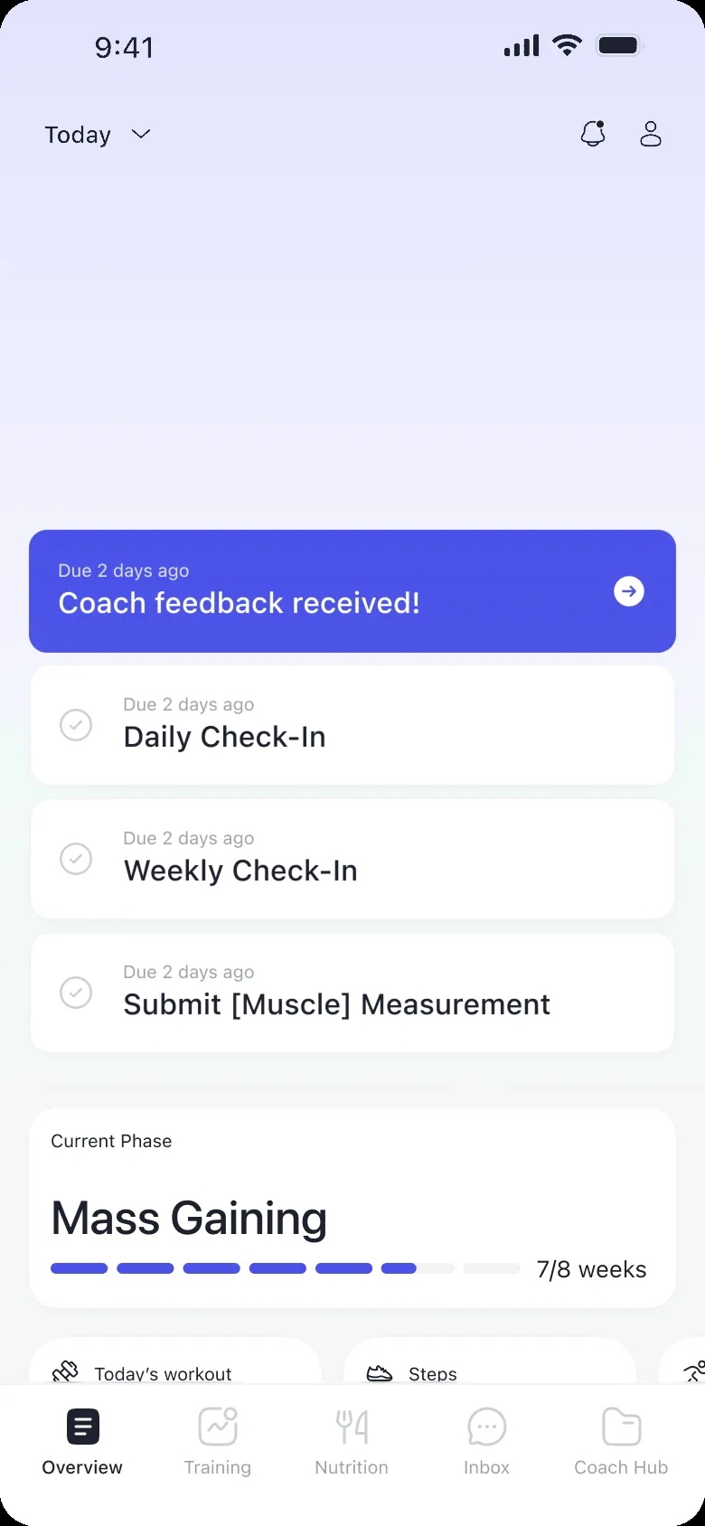
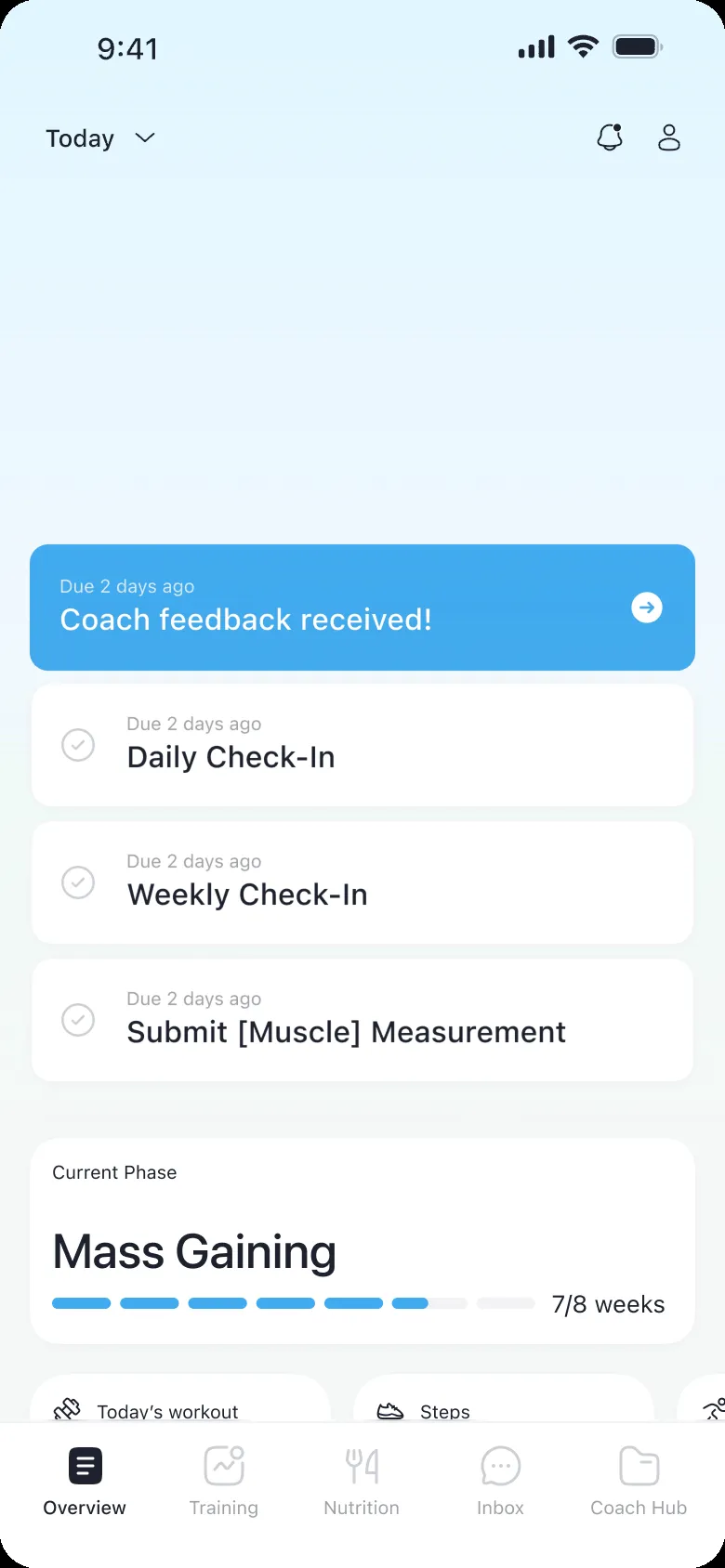
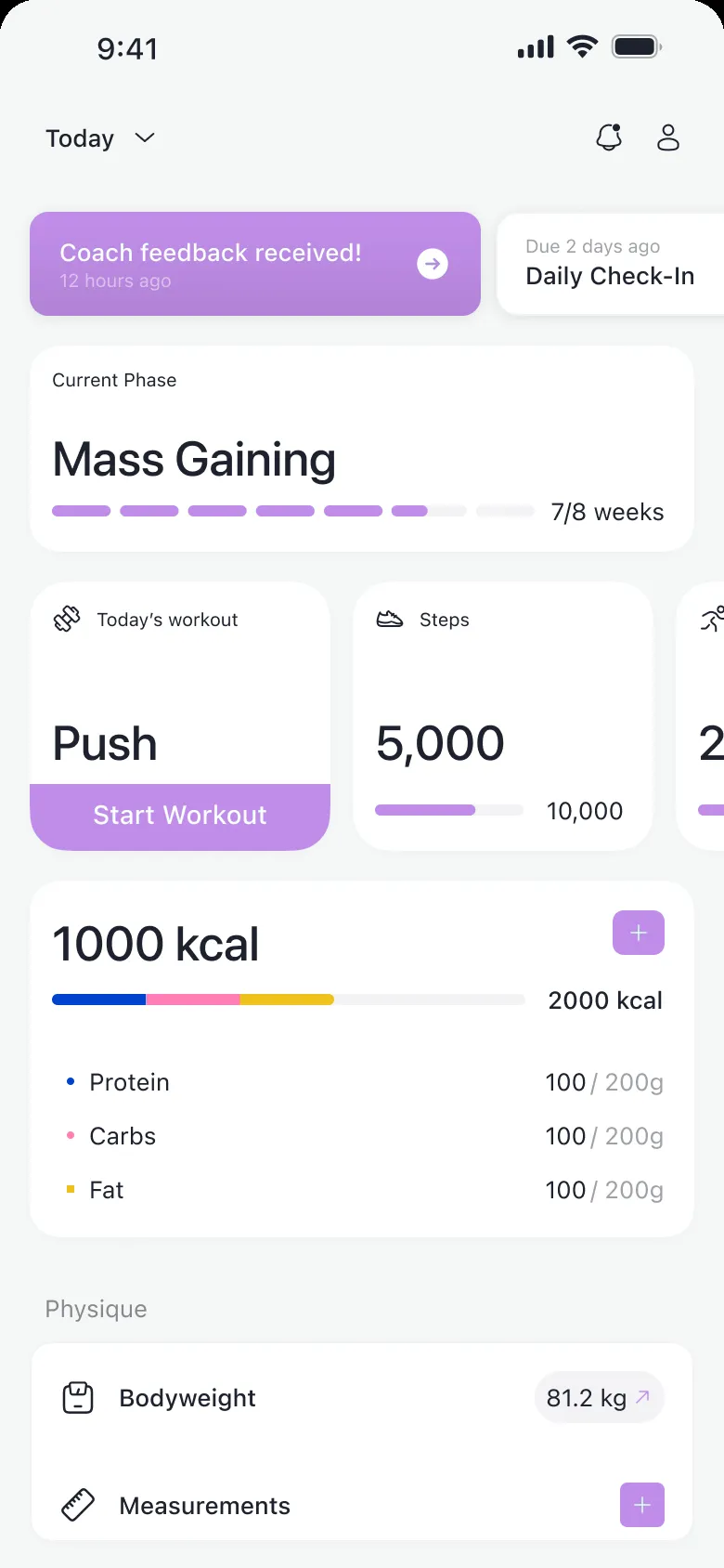
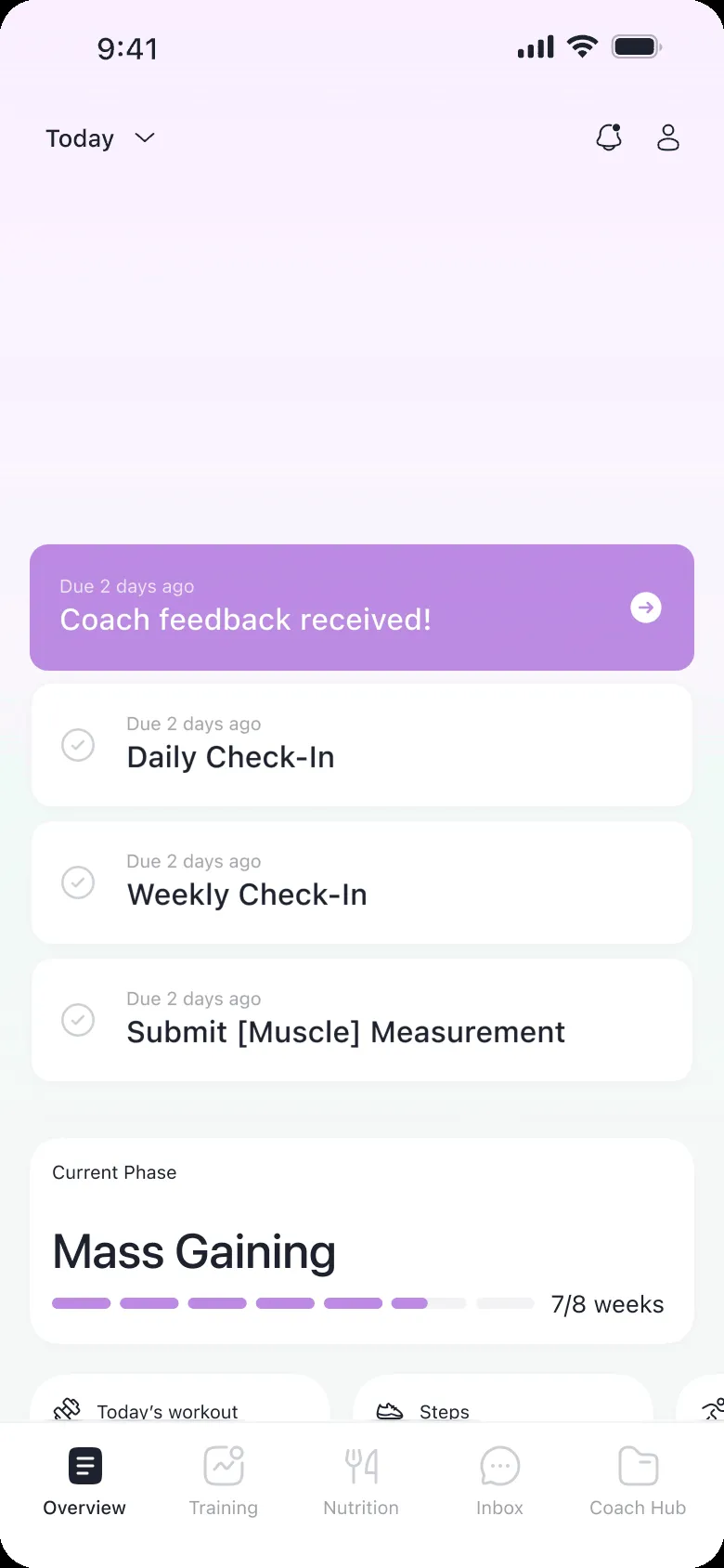
So I built the home around the plan. At the top, what to do today: the check-in, the workout, what to log. Right under it, the phase you’re in, set by your coach, and how far you’ve come. That phase card was the big change. It tells you you’re on a path someone built for you, and that logging is how you move along it. The charts didn’t go away. They just moved one tap away, off the home.


- “What do I do today?”
- “Why am I doing it?”
- “What’s left to do?”
These changes came with a trade-off: clients who want to explore their charts now need one more tap. Next to other fitness trackers, 1FIT might look like it does less. Showing clients their progress over time is the first thing I’d explore in the app’s next iterations.
Decision 02
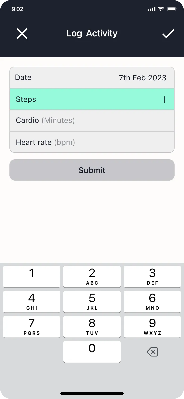
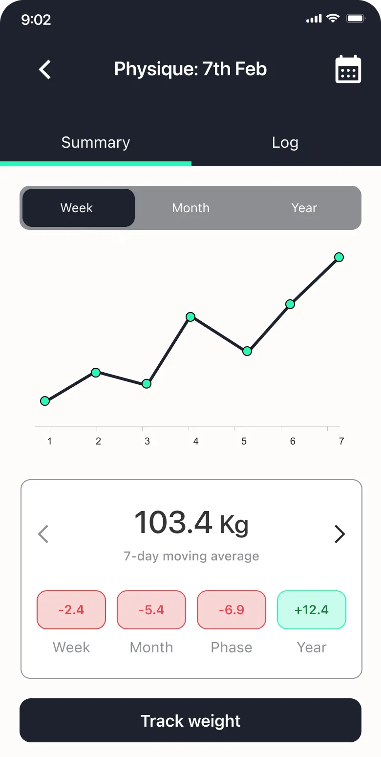
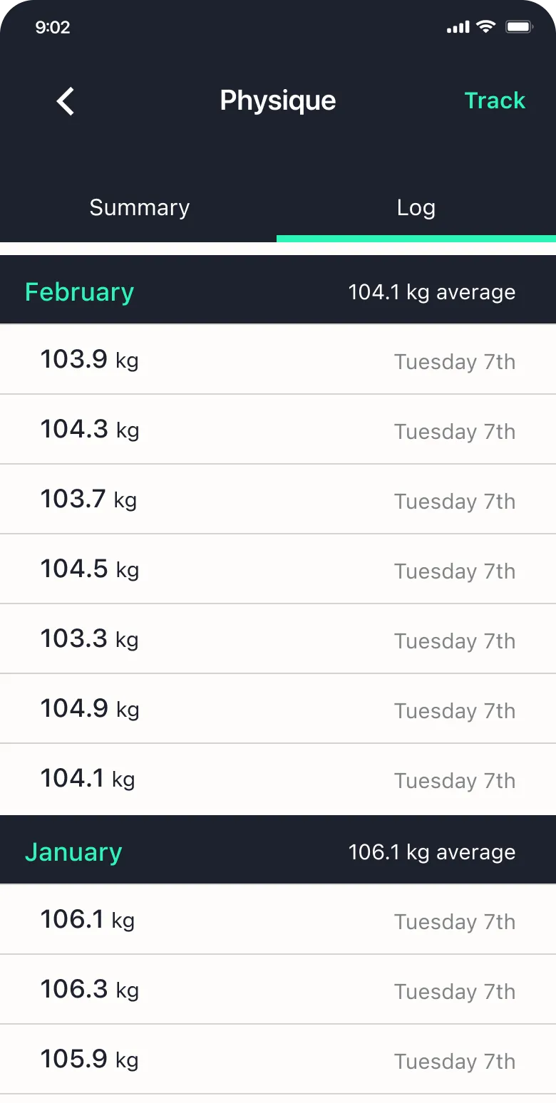
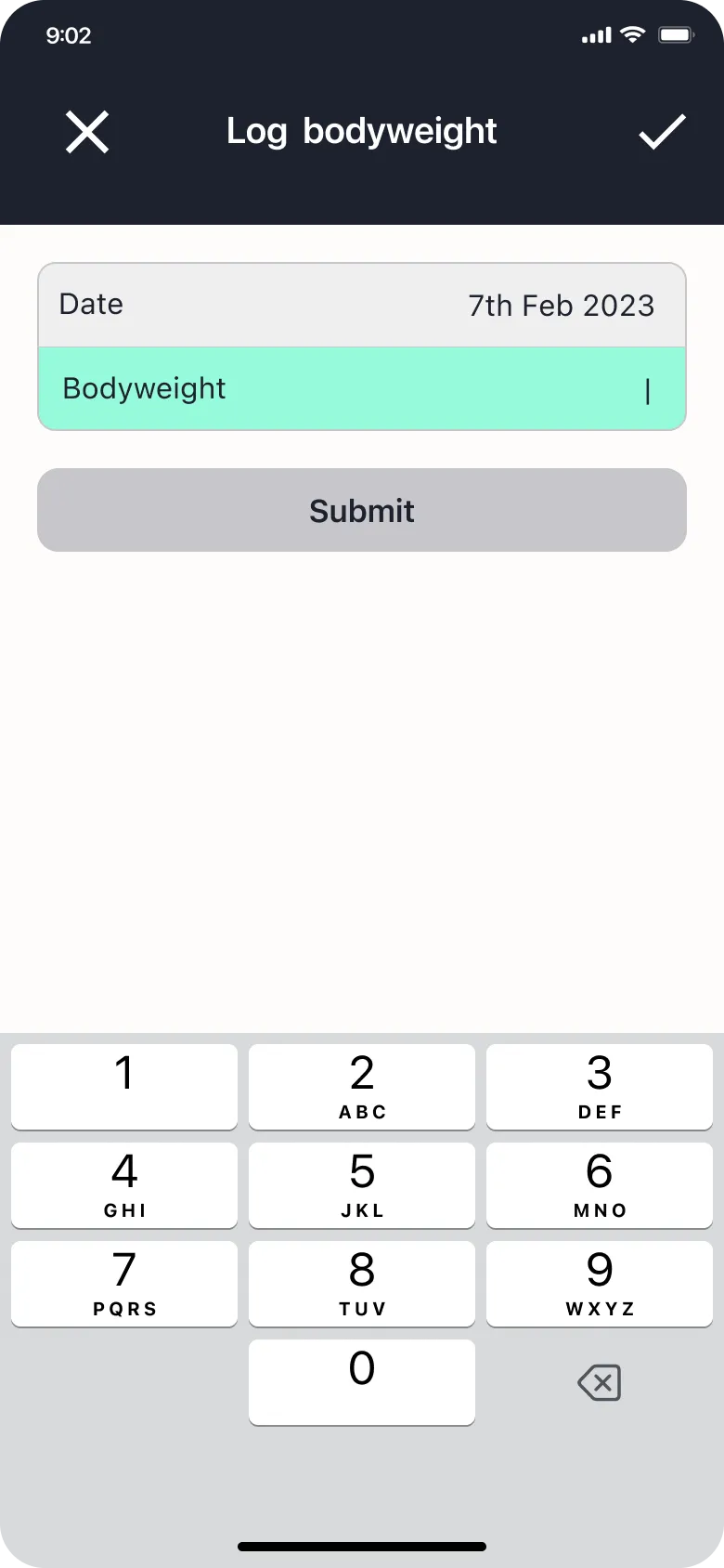
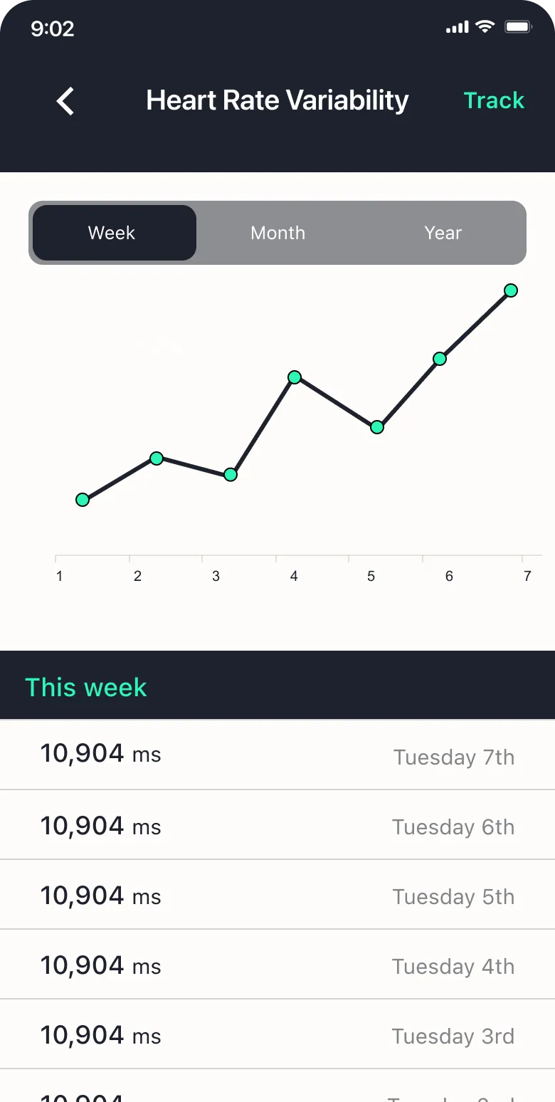
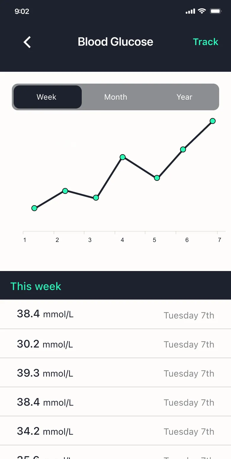
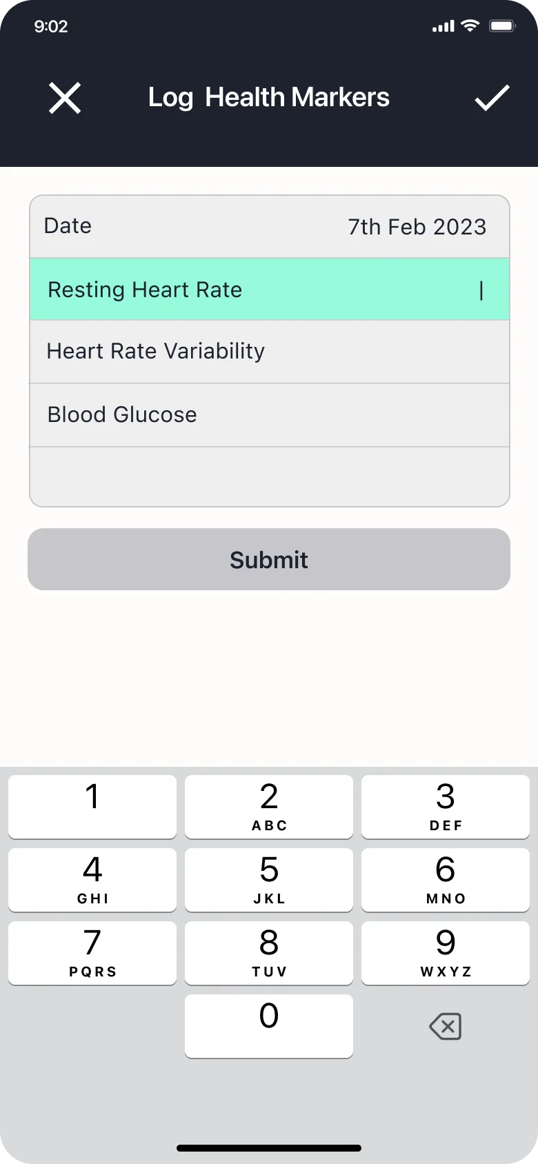
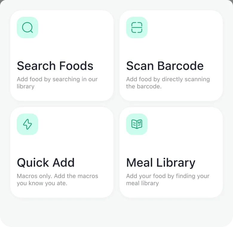
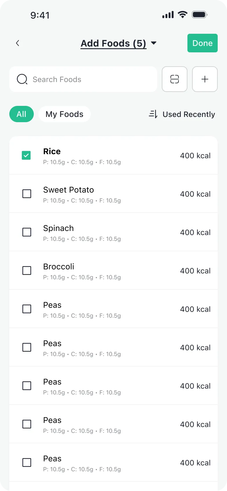
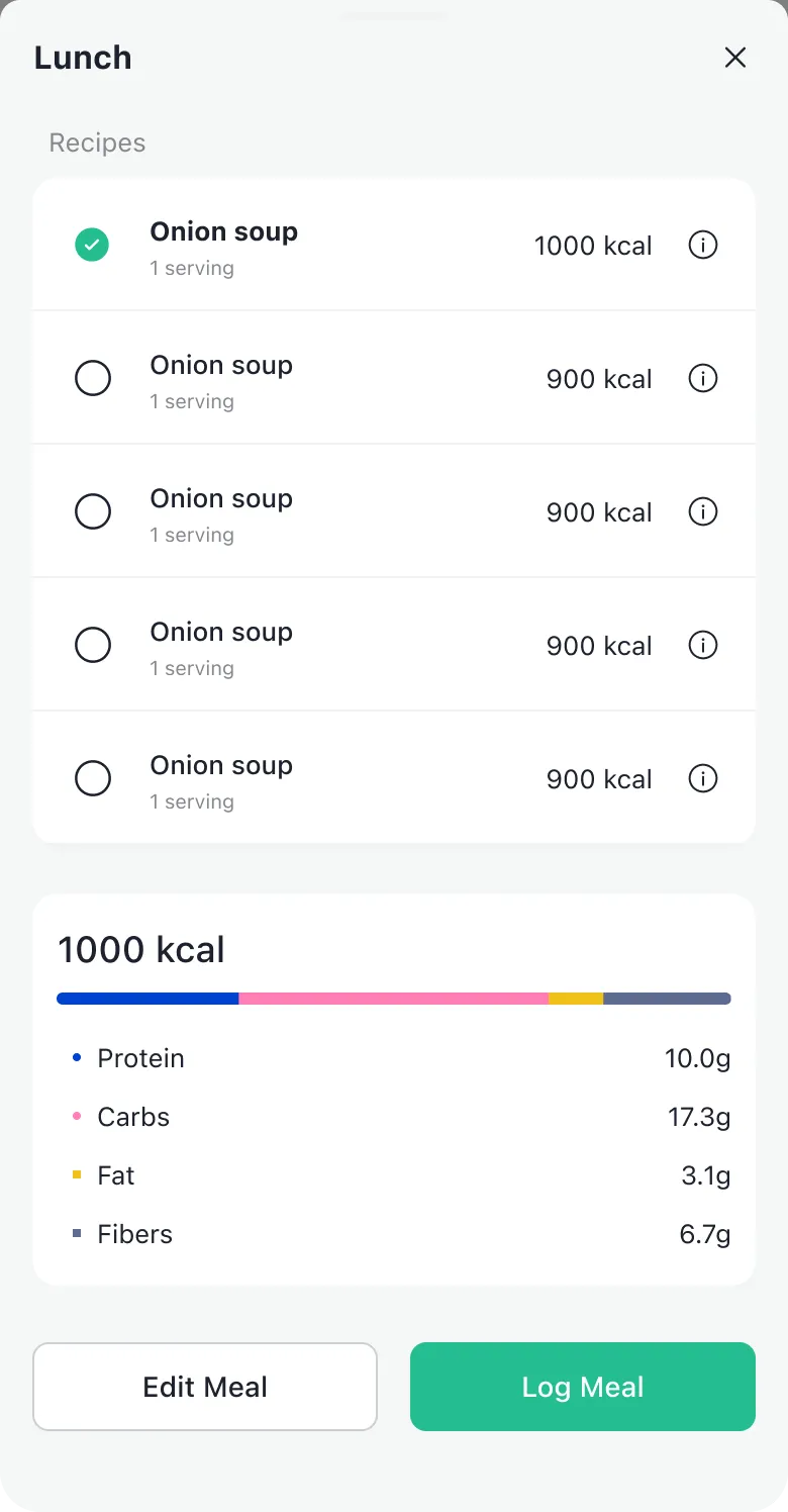
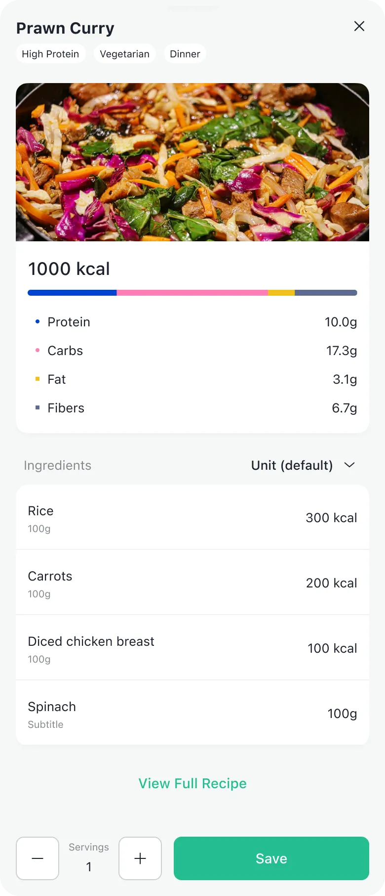
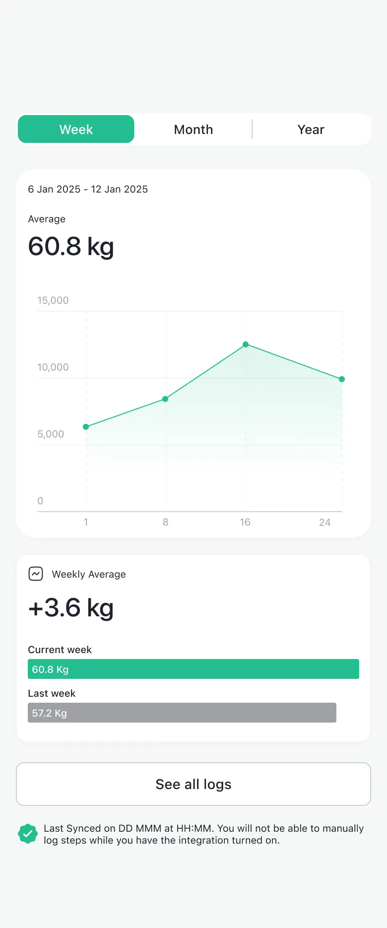
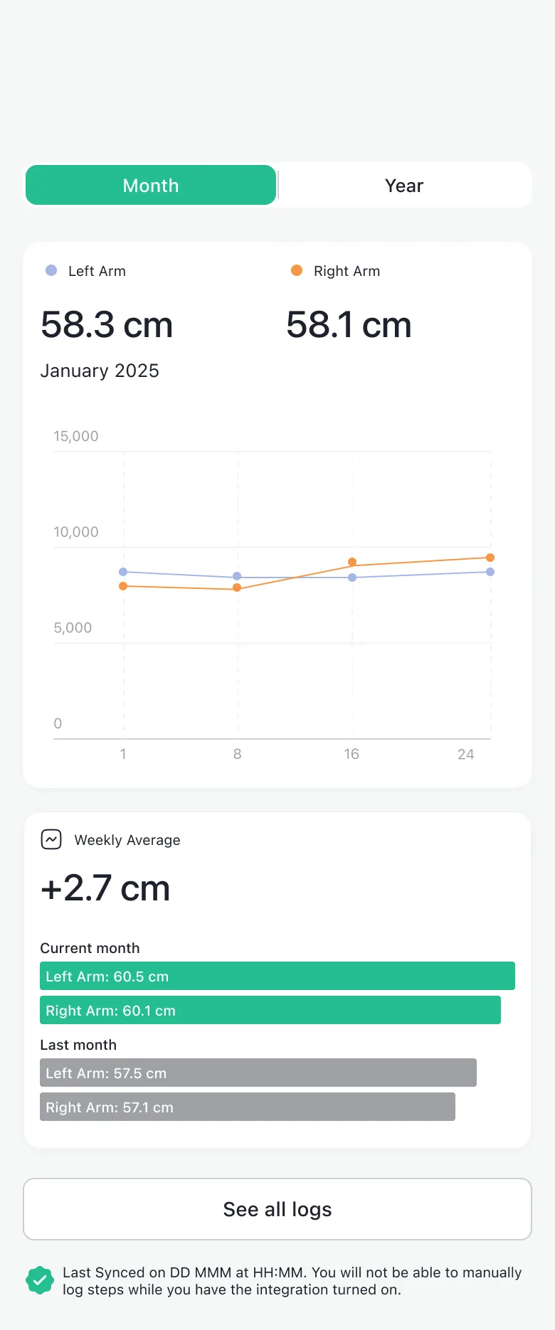
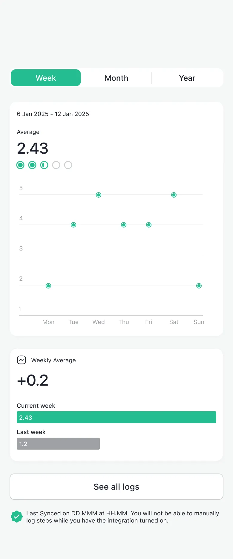
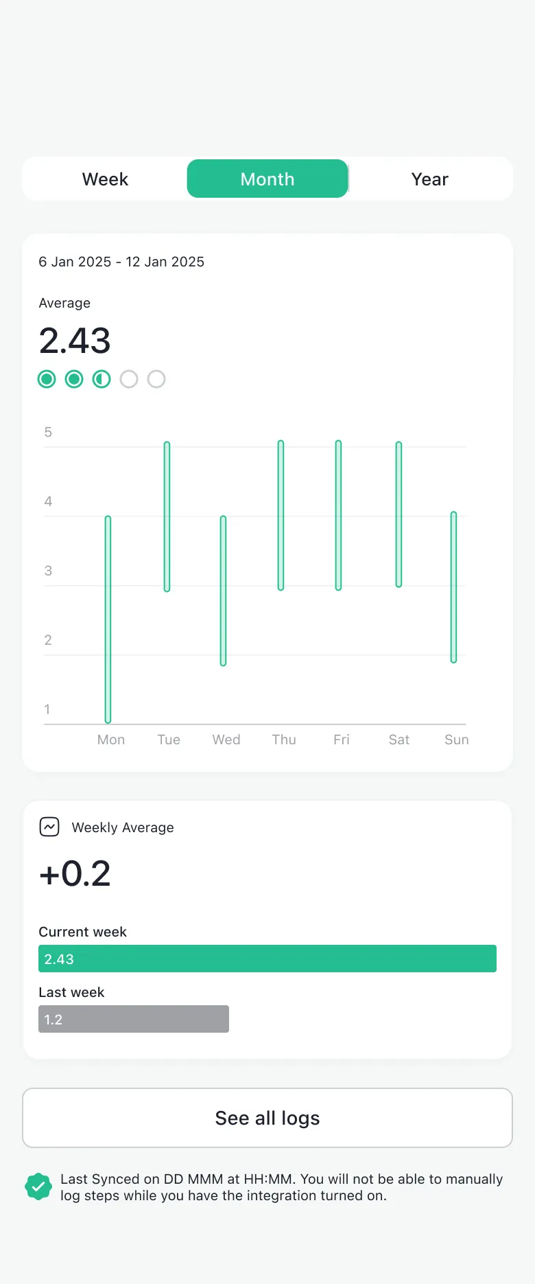
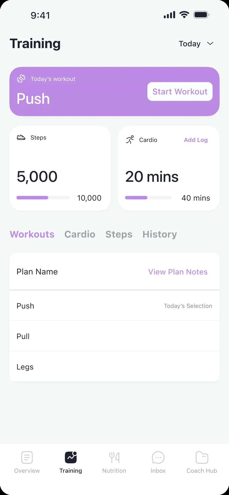
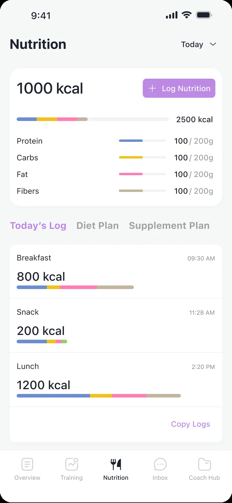
Easier and faster metrics logging
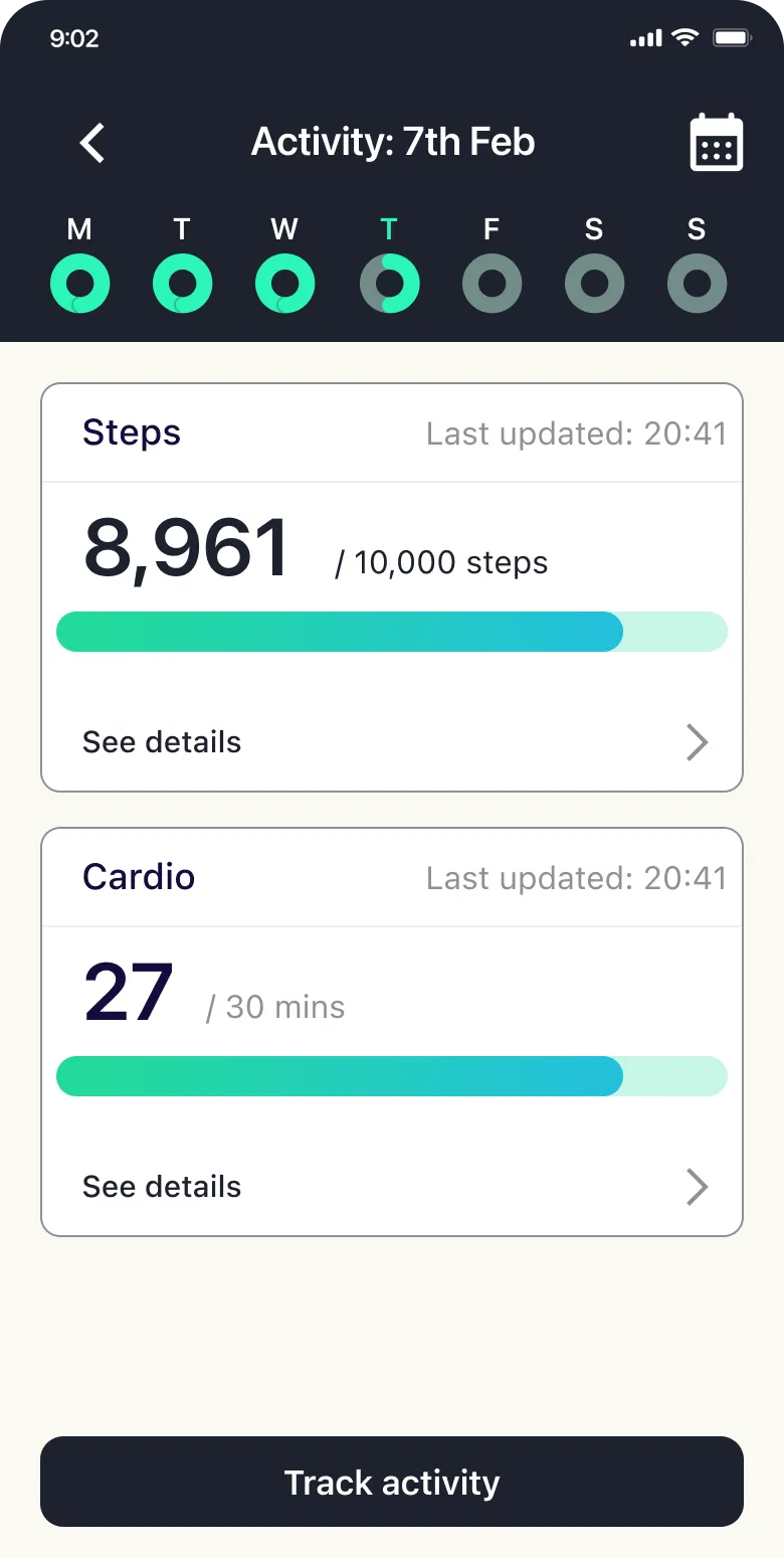
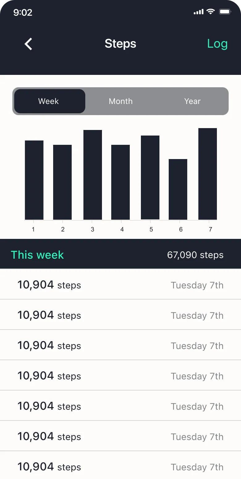
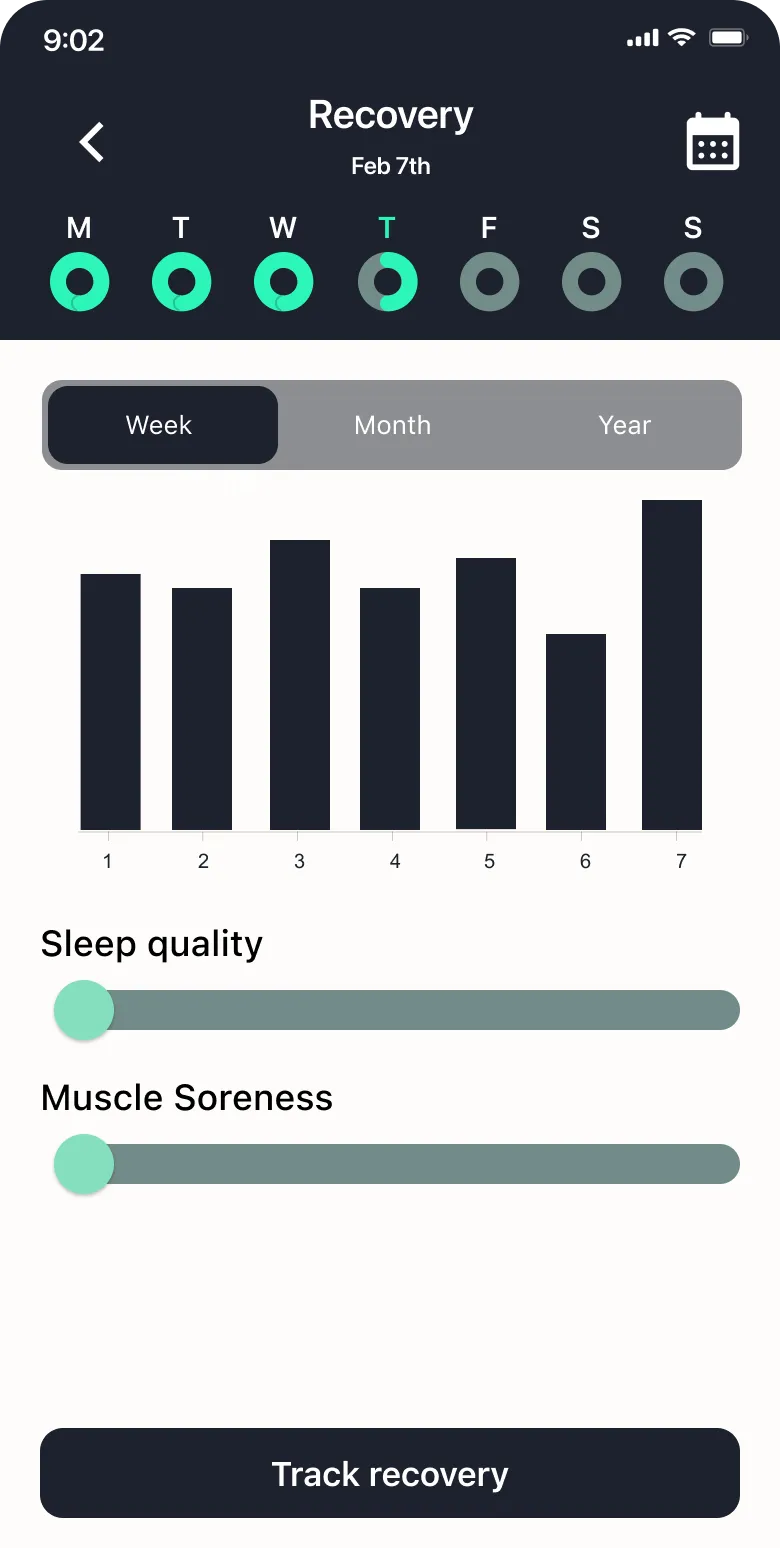
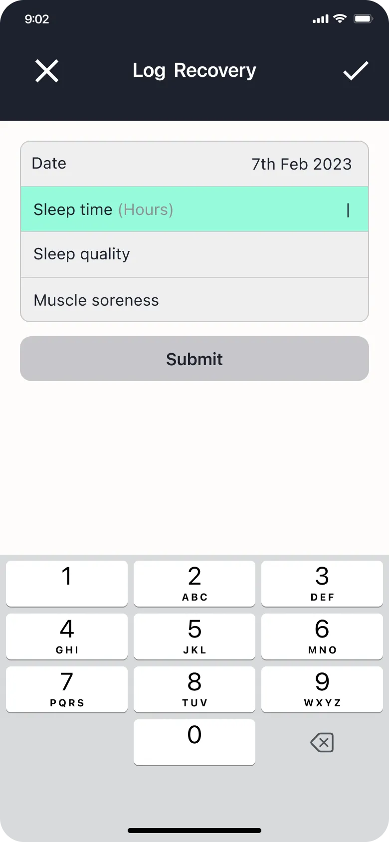
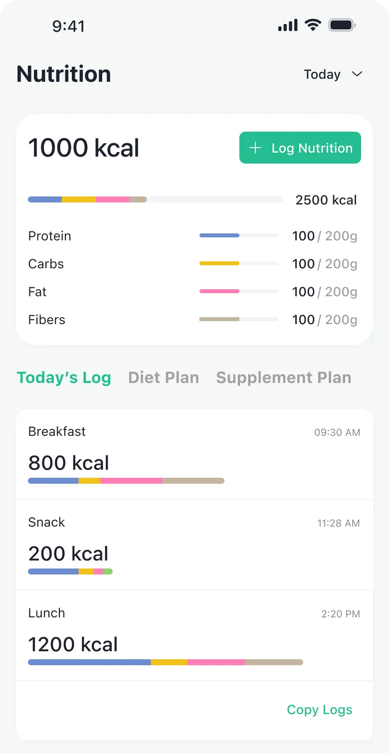
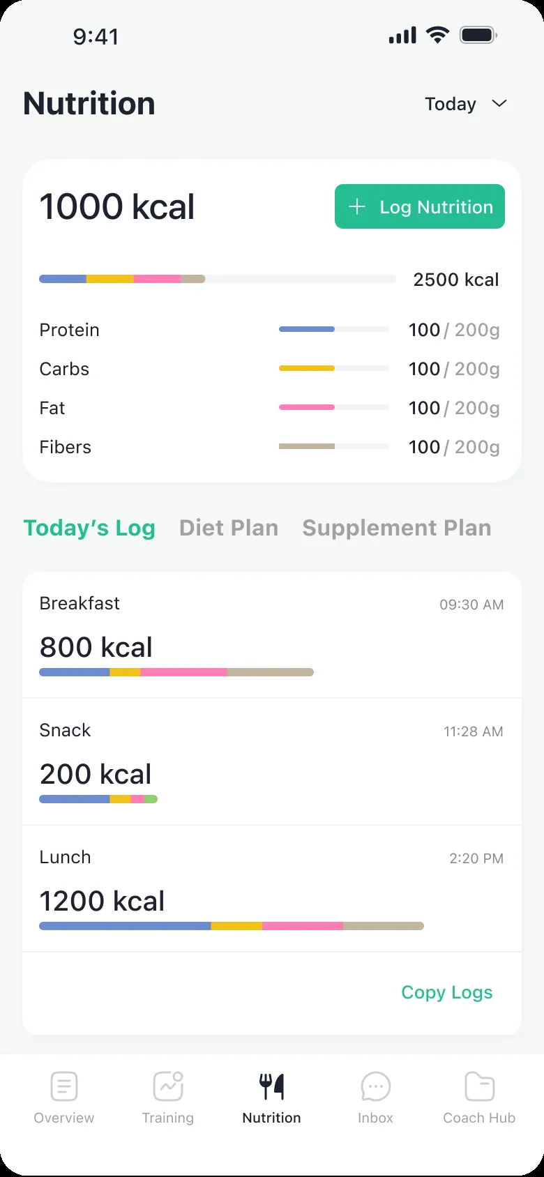
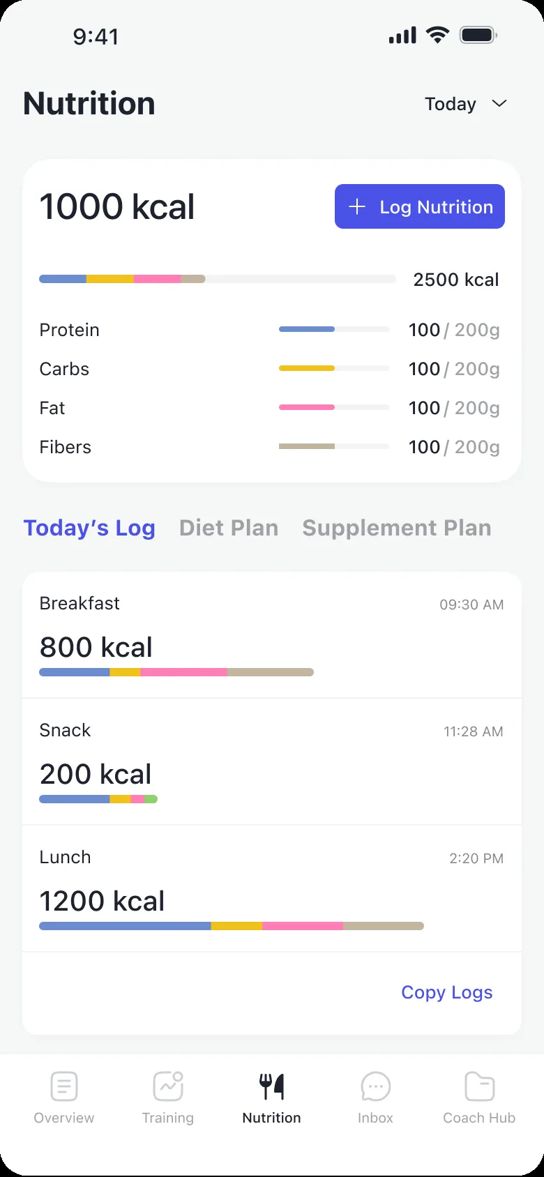
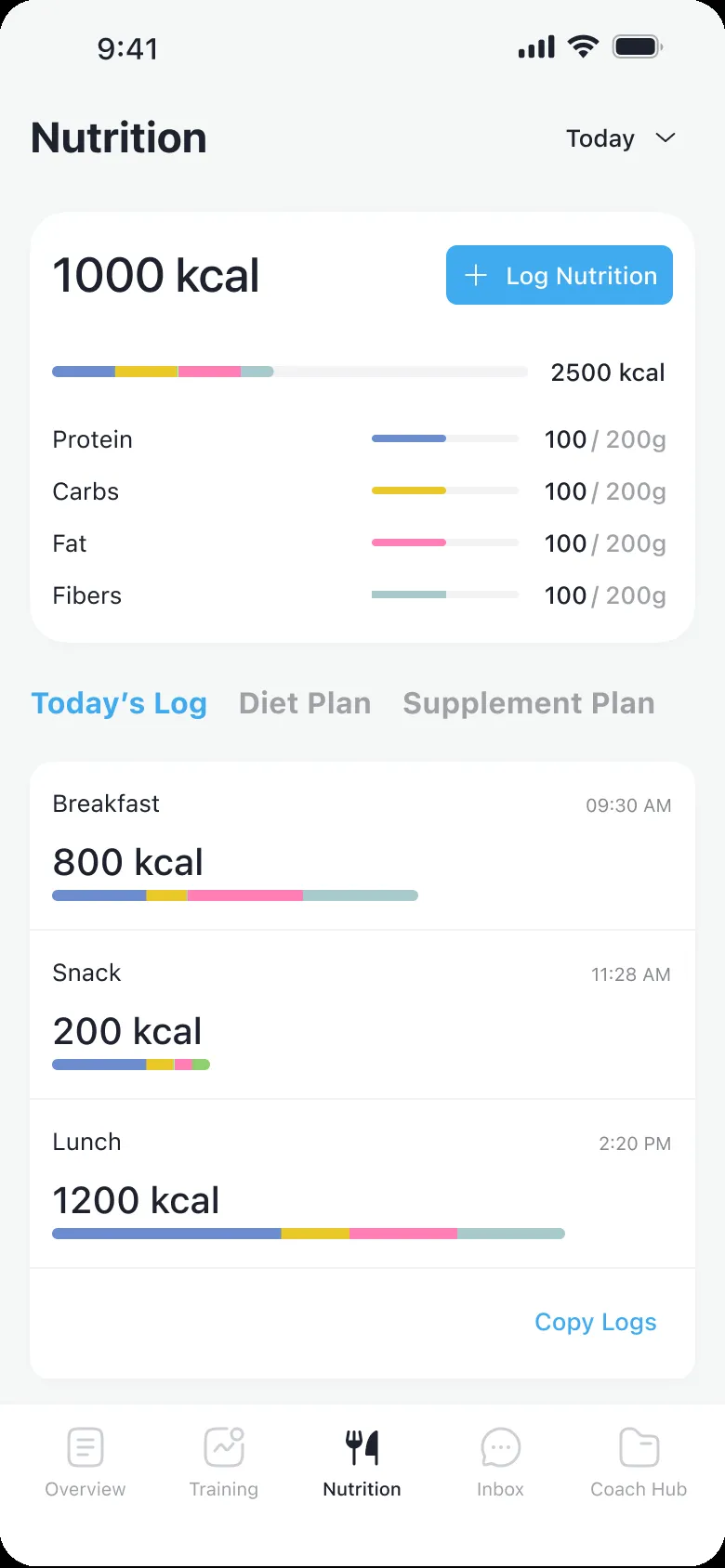
Most days, a client opens the app for one thing: log what they ate, what they weigh, what they trained, and see where that leaves them against the plan. In the old app each of those sat a few taps away, with no sign of how they were doing.
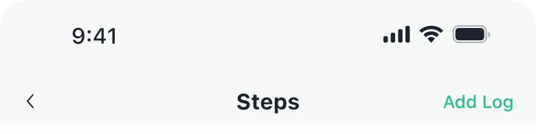
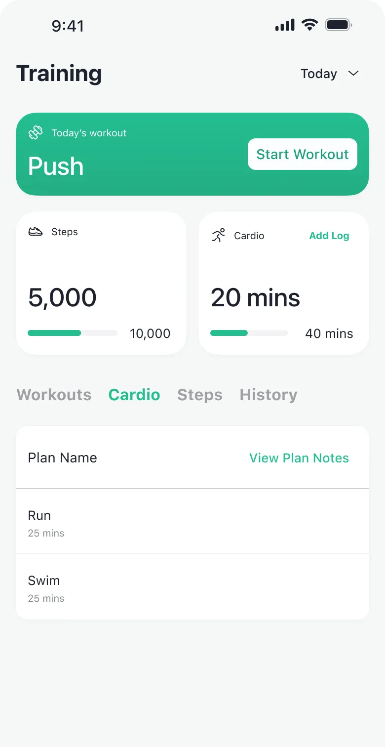
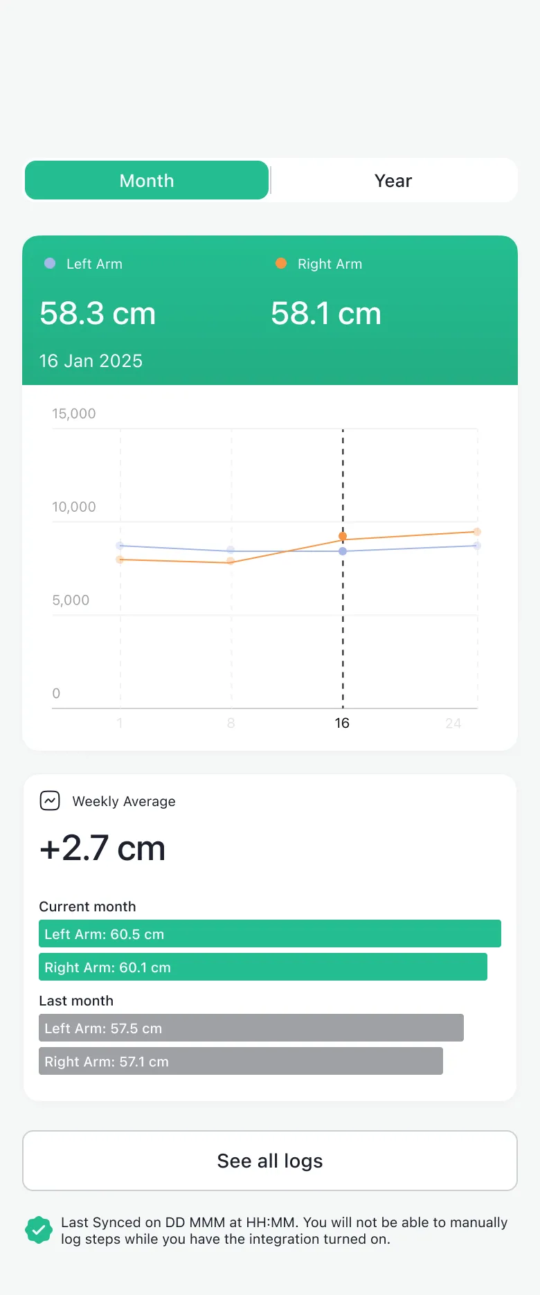
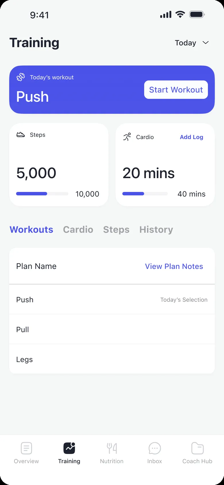
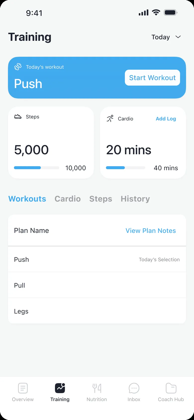
Now the way to log something sits next to the number it changes, in the same place on every screen, one tap from the home.
After
Before
Decision 03
A look any coach can brand as their own
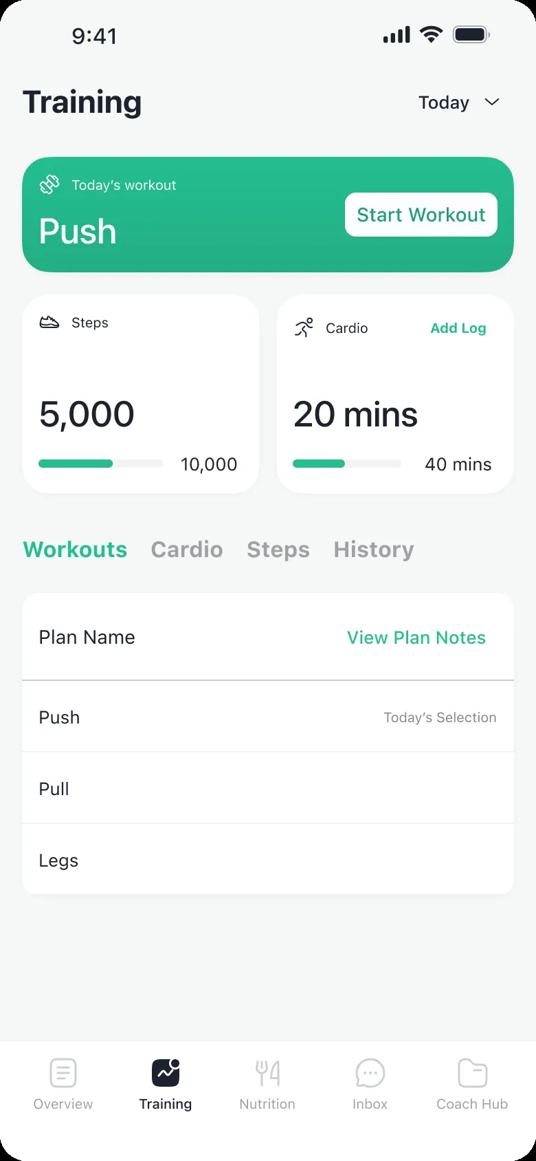
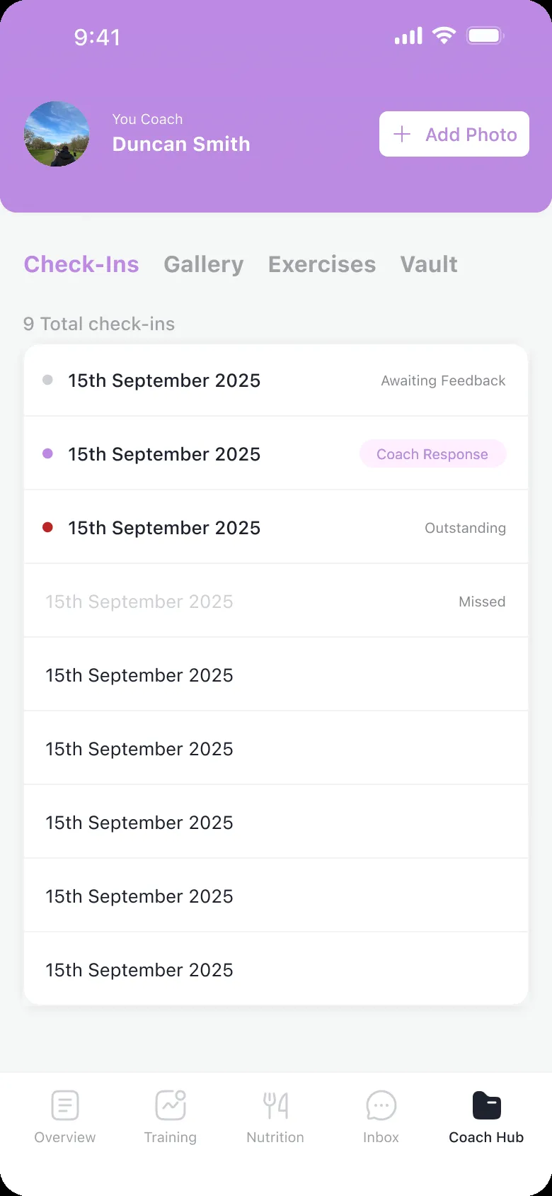
1FIT sells the app to coaches, who give it to their clients under their own name. With a bootstrapped team the brand swap had to stay cheap: a logo and one colour. So the design has to look right with any logo and any colour. I kept everything else quiet, white and grey with one typeface, and gave the colour one job: it marks what you can act on.
The price is that 1FIT’s own app looks plainer than it could.



What shipped
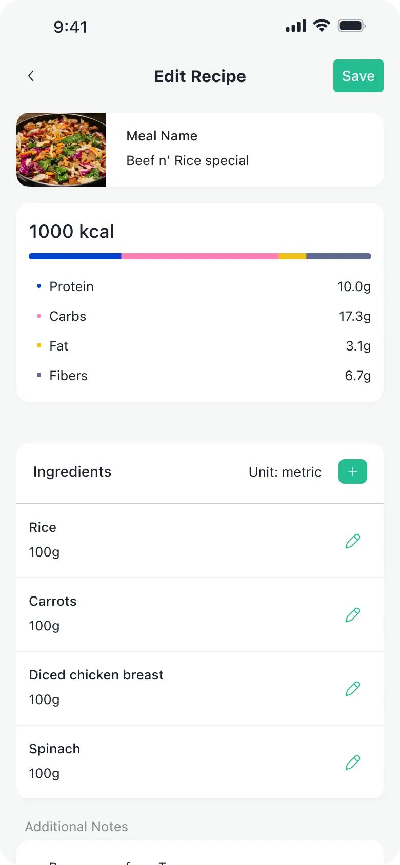
Everything above shipped in the native app in September 2023, then updated through 2024.
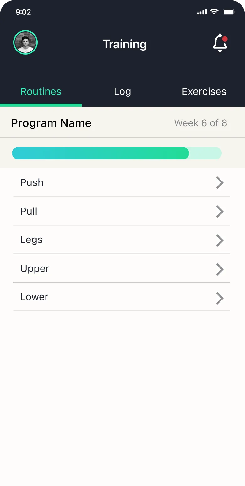
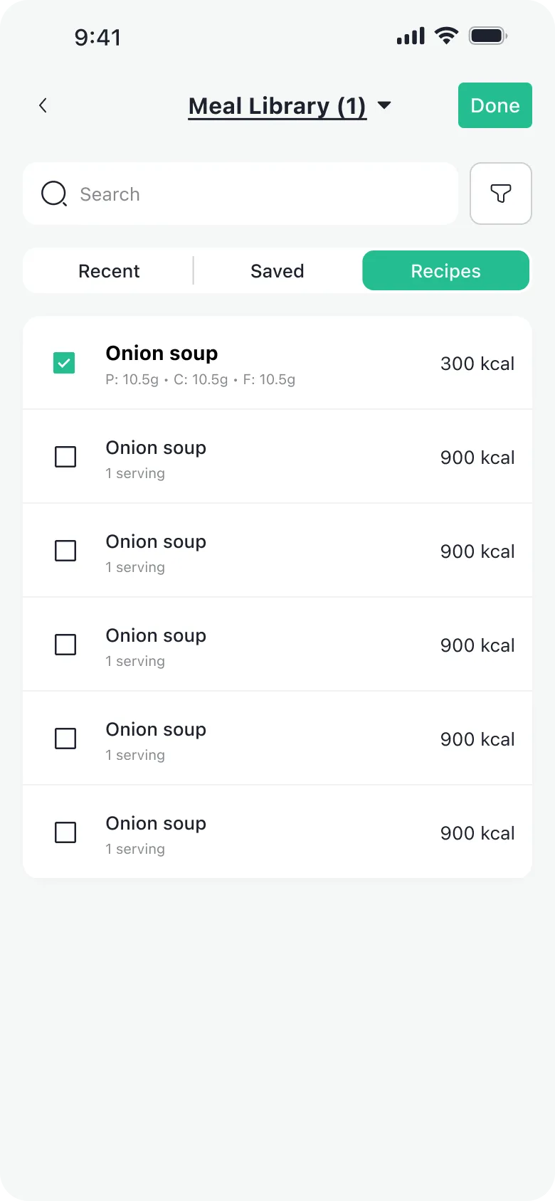
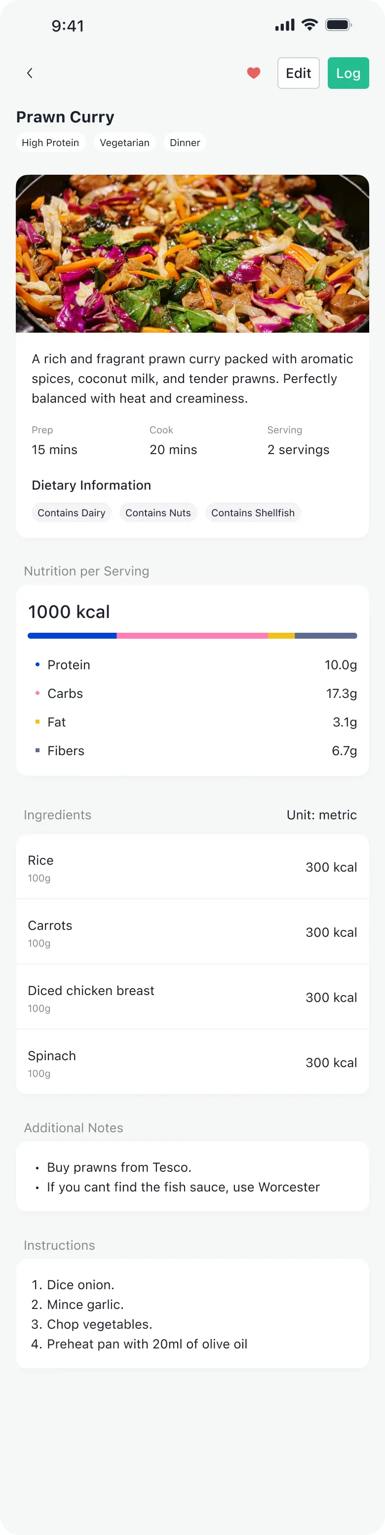
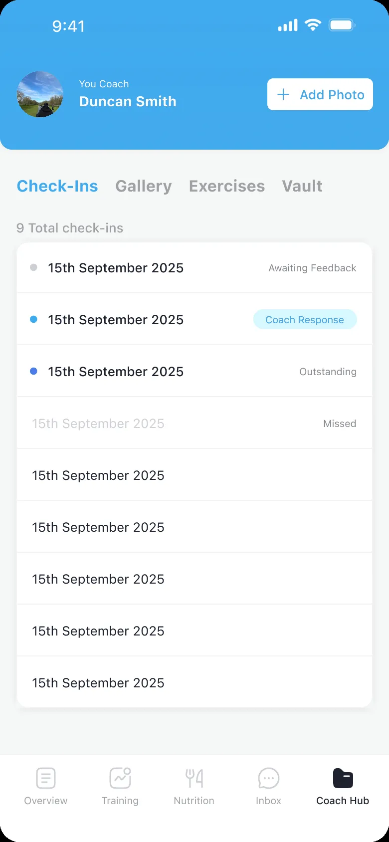
- The home as today’s tasks and the phase; training, nutrition and the Coach Hub rebuilt around them.
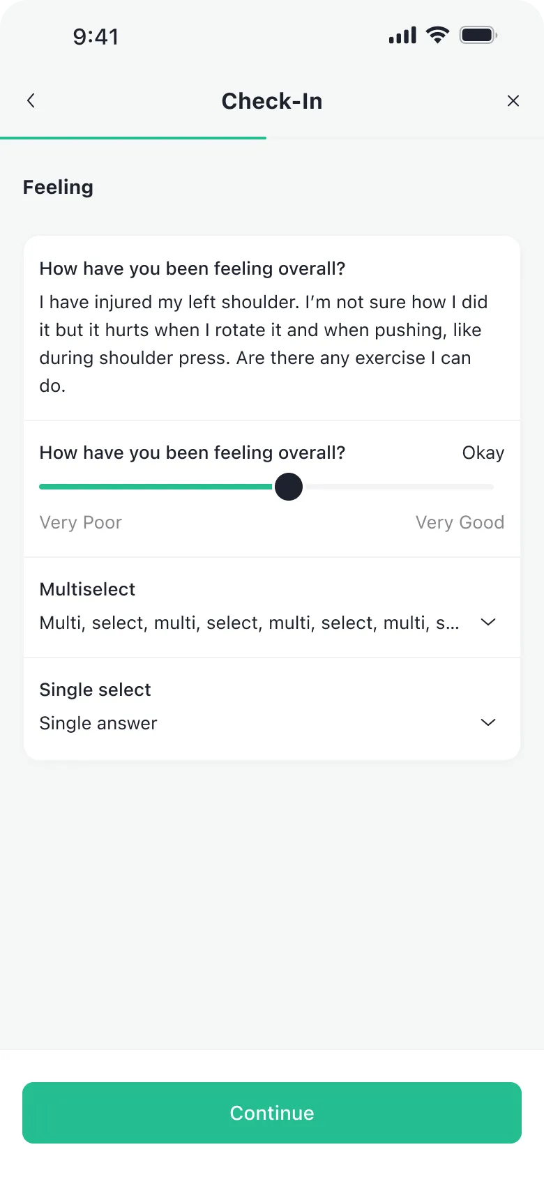
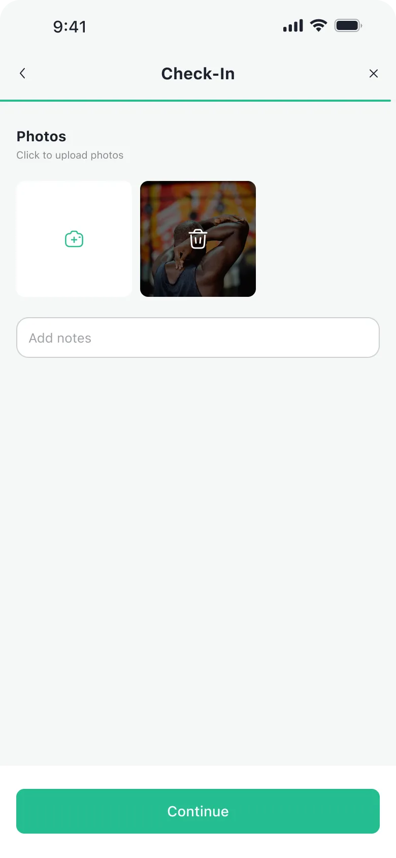
- Daily and weekly check-ins, set up by the coach; the check-in opens with the coach’s reply, and the list shows which ones have one.
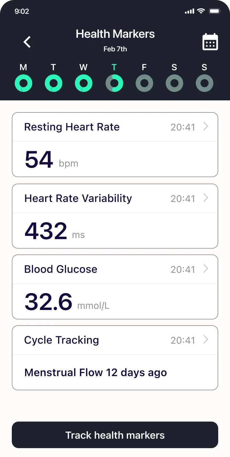
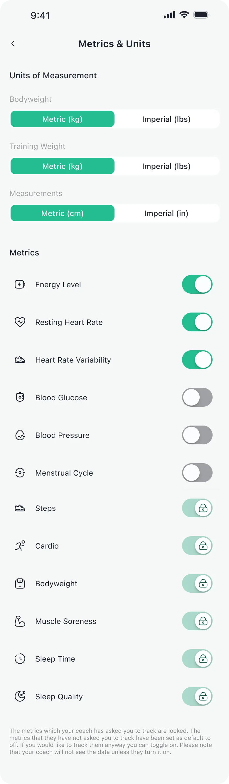
- The metrics each client tracks, chosen by the coach, so the home shows only those.
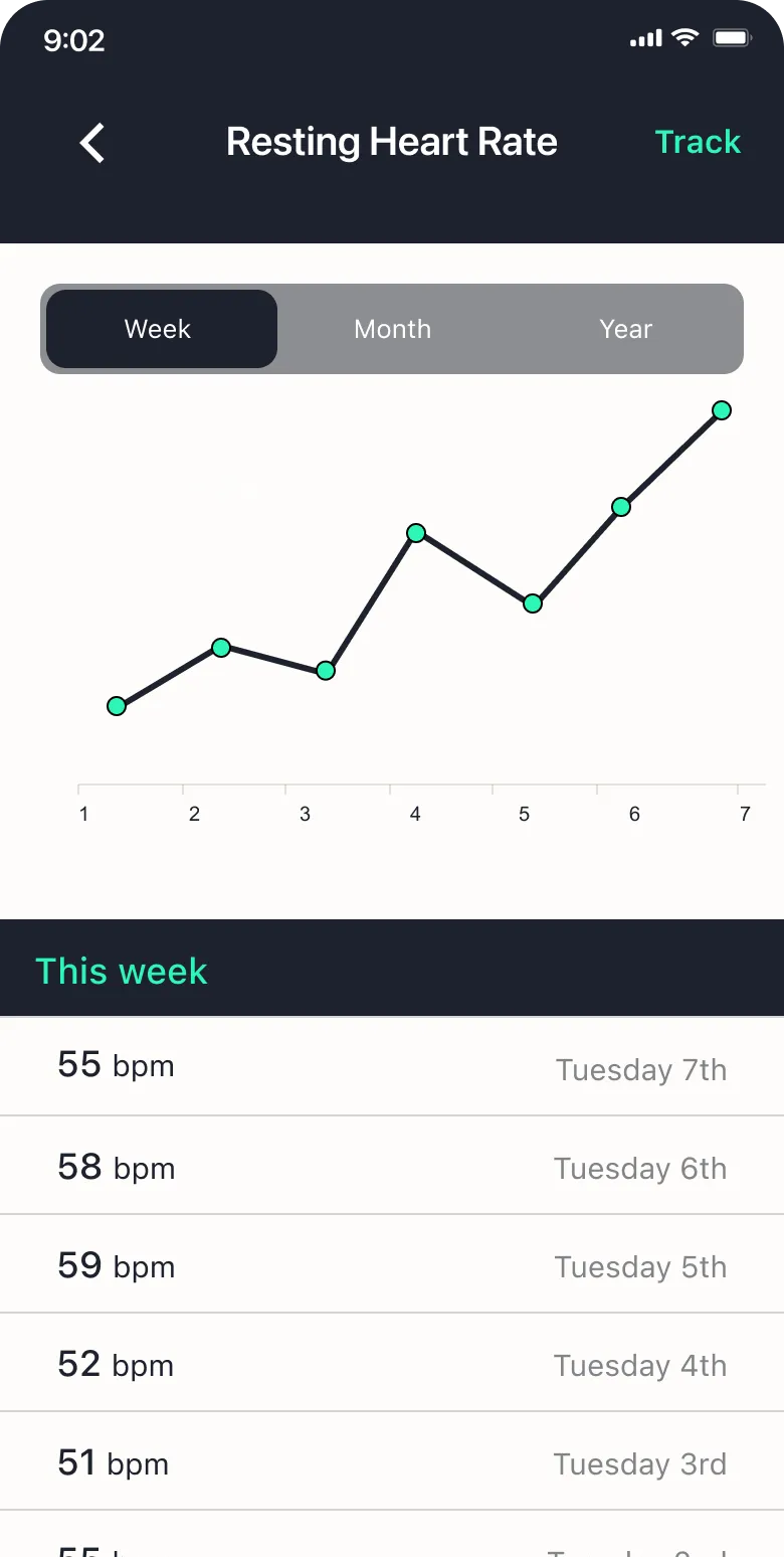
- One template for every metric.
- An iOS design system, built for the app.
- A design ready for the white label: one logo and one colour per coach.
Impact of the redesign: NPS 55 → 82
1FIT ran the same survey before the redesign and after it, in January 2024: 552 sent, 152 answers, an NPS of 82 against 55. The same release moved the app to native and added other features, designed and developed throughout 2024.
Not shipped
What I’d build next
The goal of this redesign was to give what existed a better structure and make it simpler, and that is what shipped. What it didn’t give clients was a clear view of the end goal, the reason they were doing it all: reaching their fitness goal.
The next design exploration would focus on visualising progress over time towards that goal, with more weight on the coach’s feedback. In particular, I’d redesign the weekly check-ins’ feedback and the phases visualisation, so that we can support user motivation through visualisation of their change over time and progress in the fitness metrics.


What I learned
Choosing trade-offs that matter
The most important decision wasn’t a screen: it was choosing what the home shows first. We put the coach’s plan first and moved the charts one tap away, knowing the trade-off: next to other trackers, 1FIT would look less polished and modern.
Design for the user’s higher-level goal
We made logging easier, and that shipped. What I’d do differently is show clients what their logging adds up to: their progress towards their goal.
Behind the work
- Product design
- Giona Fossati: the audit, the interview, the IA map, the iOS app’s UX and UI, its design system, the white label
- Product and sales
- A co-founder, who had designed the first app and brought me the coaches’ feedback
- Engineering
- A co-founder as tech lead, two full-stack developers
Questions about this project?