 Kunveno2021
SmarTerp: design of an interface for a highly cognitively demanding situation — simultaneous interpretation
About SmarTerp
Understand the needs of simultaneous conference interpreters and design an interface that supports them when they interpret remotely.
I led the product design of SmarTerp, a computer-assisted interpreting (CAI) tool. I ran the user research, the wireframing and the usability testing. Beyond this interface, I helped the Product Owner ground long-term design choices in the business needs. The project was also the subject of my MSc thesis in Human-Computer Interaction, now in the Universidad Politécnica de Madrid’s digital archive.
CAI tools are software made for interpreters: they are the interpreter’s workstation. SmarTerp aims to lessen the cognitive effort of interpreting by giving interpreters automatic speech recognition (ASR) while they work.
UCD process
To design the platform’s main feature, the interface for oral language interpreters, I followed the steps of user-centred design within the project’s budget and time. I chose which methods suited the project, ran them, synthesised the results and presented them.
Phase 1: Grounding and exploration
Stakeholder interviews · User work models · Flow model
User-Centered Business CanvasPhase 2: Data elicitation
User interviews · Contextual inquiry
Phase 4: Data modelling
Hierarchical task inventory · User journey map · User personas
System interaction journeyPhase 5: Prototyping and evaluation
Low-fidelity wireframe · Design critique · High-fidelity mock-up · Interactive prototype · Usability test · Insights
Conclusions and future work
Design constraints
- Interface and console bound by ISO/PAS 24019:2020 for interpreting platforms
- Half of the interpreters interviewed had a visual impairment
- Seven months and a set budget, so every research method had to earn its place
End result
Section 1
Exploration
The first phase set out the design and business context. From the stakeholder interviews I defined the user work models and the system’s flow model.
Stakeholder interviews
The interviews gave me the company’s business goals, the target users, and the roles, duties and actors inside and outside the organisation. What they told me went into the User-Centered Business Canvas below. Four stakeholders came out of them, two primary and two secondary:
| Stakeholder | Goal | Problem |
|---|---|---|
| InterpreterPrimary stakeholder | Provide better interpretation quality. Digitalise their work | No conference platforms tailored to interpreters’ needs |
| Multinational company (customer)Primary stakeholder | Offer the attendees of its remote conferences simultaneous interpretation of the speakers | Having to handle the physical and technical organisation of the interpreters |
| System operatorSecondary stakeholder | Ensure the quality of the system’s connection | Diagnosing and fixing technical problems during the conference |
| Interpreter coordinatorSecondary stakeholder | Give the client the best interpreting quality | Handling communication and requests between the interpreters and the client |
System flow diagram
A system flow diagram showed the roles, responsibilities and flow of information within and outside the organisation, and where SmarTerp fits in that environment.
User-Centered Business Canvas
I summarised the interviews in a User-Centered Business Canvas. It echoes the Business Model Canvas and adds what user experience planning needs, giving a first view of how business and user problems relate. It helped me draw out what the subject-matter experts knew, across meetings, workshops and design critiques, and see which capabilities the stakeholders believed the platform needed to succeed.
Section 2
User research
To learn about the users’ problems and their context of work, I ran user interviews and a contextual inquiry, asking interpreters to describe their most recurring problems and watching them work.
User interviews
I interviewed ten target users, five of them with a visual impairment (three blind, one with retinitis pigmentosa, one with low visual acuity). I used the critical incident technique: each interpreter told the story of a meaningful incident from their past work. This surfaced the problems that disrupt their work the most.
Contextual inquiry
Interviews alone could not capture how complex the working context is, so I ran a contextual inquiry, a mix of observation and interview, at the biennial congress of the Colegio Oficial de Odontólogos y Estomatólogos de la Primera Región (COEM) in Madrid. I watched oral language interpreters working on an online conference: under the COVID-19 protocol each interpreter sat in their own soundproof booth, while the speakers joined by video call.
Section 3
Findings
I analysed the research with affinity diagrams and synthesised it in a persona, an empathy map and a user journey map.
User persona and empathy map
The observed behaviour, the critical incidents and the analysis produced the persona of the oral language interpreter, which every later model used to motivate design decisions.

Katy, 58
Oral language interpreter
- Madrid, Spain
- Spanish ↔ English
- Medical events
- Part-time university professor
- Freelance
Goals
- Produce high-quality translation
- Save time in preparation
- Enrich her personal glossary
- Network with boothmates
Problems
- Isolation from her boothmate
- Numbers
- Specialised terminology
- Recognising and reproducing proper names
Needs
- Knowing her boothmate is there to support her
- A direct line to solve technical problems
- Her personal glossary at hand
- High-quality audio
- Knowing how long the session lasts
Fears
- Being held responsible for technical problems
- Her boothmate not showing up
- Not having the speakers’ terminology
User journey map
The journey is “as-is”: its steps and problems are the interpreters’ actual experience, so it shows the critical moments that need intervention. It follows Katy before, during and after a session; each phase has its tasks, pain points and design opportunities, with the pain points mapped to her feelings.
This interface tackles the central part of the journey: starting to interpret, the session, and finishing. That is where the core of the job happens, so its pain points came first.
Pain point: Having to guess where her boothmate is going to stop interpreting
Design opportunity: A handover procedure
Pain point: Adapting the many console settings to her boothmate’s
Design opportunity: Inherit the console setup at handover
Pain point: Checking when her boothmate switches the microphone off, to switch her own on
Design opportunity: Notify her when her boothmate switches the microphone off
Pain point: Selecting the wrong output channel by mistake
Design opportunity: Let the operator override the console settings
Pain point: Poor input audio quality
Design opportunity: Ensure high audio quality
Pain point: Being disturbed by people passing by
Design opportunity: A communication channel with technical support
Pain point: Not remembering the translation of a specialised term
Design opportunity: Automatic speech recognition that suggests terms
Pain point: A problem with the input audio: she hears nothing
Design opportunity: Send notifications about technical issues quickly
Pain point: Her boothmate takes over five minutes late
Design opportunity: A private audio and text channel with her boothmate
Section 4
Prototyping and evaluation
Prototyping turned the design opportunities and user requirements into solutions, iteratively. I showed low-fidelity mock-ups made in Balsamiq to the subject-matter experts and stakeholders, folded in their feedback, then produced the high-fidelity mock-up in Figma and tested it in remote sessions with ProtoPie.
The layout
The interface had to meet the strict requirements of ISO/PAS 24019:2020 for simultaneous interpreting delivery platforms. Alongside them, I took in the requirements from the interviews with the accessible users.
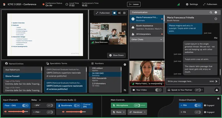
Under the video sits the heart of SmarTerp: its automatic speech recognition (ASR). Three live columns, Named Entities, Specialistic Terms and Numbers, fill up from the speaker’s words as they are spoken, entities and terms with their translation: the very things the research found hardest to catch.
Video conference. The speaker and their slides, in the largest part of the screen.
Automatic speech recognition (ASR). Three live columns, Named Entities, Specialistic Terms and Numbers, filled from the speaker’s words as they are spoken, entities and terms with their translation: what interpreters find hardest to catch (Katy’s problems above).
Communication. Chats with Booth Assistance, the boothmate and all interpreters, and the boothmate’s video.
Soft console. Every audio control in one strip along the bottom: channels, the boothmate, the microphone.
The soft console
A key difference from competing solutions: the interpreter can listen to their boothmate while the boothmate is interpreting, with its own volume control. Beyond that, the console had to follow the strict requirements of the standard. What I learned about the users’ context led to these decisions:
- Controls grouped, with labels that tell them apart
- Built on what users already know from hardware consoles
- Meaningful keyboard shortcuts for expert and accessible users
- Multimodal signs for the state of the system and the controls: text, colour, sound and visuals
Input channels. The floor’s language with its own volume, and the other booths’ channels to take relay from.
Boothmate. The boothmate’s voice on its own channel and volume, so the interpreter can follow them while they work.
Main controls. The microphone, mute and the handover to the boothmate, grouped and labelled like a hardware console.
Output channels. The language the interpretation goes out in.
The communication module
During remote events interpreters asked for help in WhatsApp groups and felt isolated from their boothmate. The module brings help and the boothmate into the interface:
- Help on request through the “Booth Assistance” chat
- The boothmate’s presence shown through a status indicator and a private video connection
- A “Report a problem” function
- “Hide chats”, so messages from secondary channels don’t distract during interpretation
Evaluated prototype
I built the prototype in ProtoPie and ran the tests with the Wizard-of-Oz procedure. Five target users took part, one of them an accessibility user with retinitis pigmentosa. I synthesised the observations in a rainbow spreadsheet.
Open the rainbow spreadsheet (Google Sheets, opens in a new tab)The test observations, in Google Sheets
After each task, participants answered a Single Ease Question on how hard it felt; after all the tasks, a System Usability Scale (SUS) questionnaire. The results were positive overall: a mean SUS score of 90.5 (SD 6.7) and a mean post-task ease of 6.5 (SD 0.3). The sample is too small to be statistically valid, but the scores agree with the success rate of each task.
The first confusion came from the microcopy of the operator’s voice connection. It was one-way, but the message “The operator is talking to you” led users to think the operator could hear them.
The second was the microphone handover, which did not match some users’ expectations. The post-test interviews showed why: their mental models came from frequent, expert use of the handover procedures in other interpreting platforms.
Design changes
The usability test showed where the interface needed work: its graphic appearance, and the interaction design of the handover, had to be adjusted.
A clearer operator message
The notification now reads “You’re listening to the operator.”, so no one thinks the operator can hear them.
More than one way to hand over
Different procedures for handing over the microphone, to fit the habits interpreters bring from other platforms.
Stronger contrast between sections
The parts of the interface stand apart, so the eye finds each one at a glance.
Labels that say what each control does
Every control carries a meaningful label instead of relying on its icon.
Explanations for what’s new
Tooltips explain the features interpreters hadn’t seen in other tools.
Volume you can see
Larger, higher-contrast volume controls for visually impaired interpreters.
Final takeaways
A backbone for what comes next
This interface is the core of SmarTerp’s new functions and a milestone for the project: gathering and modelling the data took considerable resources, and that data is now the backbone of the project’s future developments.
Mental models outlast new designs
Users had no major problems with the system. The difficulties with the handover came from habits formed on other platforms, and offering several handover procedures solved them.
Seen as useful, and new
Interpreters found the product useful, and called some features innovative among CAI tools: the boothmate’s video, the private chat with the boothmate and the input channel for listening to them.
Remote work isolates
Like every job moving online, interpreting will face isolation. If SmarTerp becomes standard practice, interpreters lose the social side of the job: meeting colleagues and building a network. Some interviewees were already wary of the solution for this reason. To fully empower interpreters, SmarTerp will need to tackle it.
Credits
- Product design
- Giona Fossati
- UX/UI design
- Iciar Villamayor, Carlos Aparicio
Questions about this project?